

Many site owners and marketers are under immense pressure to increase the traffic going into their sites as much as possible. They follow the belief that the more traffic that gets channeled to the site, the more chances of lead generation and conversion. If there is not enough traffic to a website, there is a huge possibility that you’re missing out on good business.

Successful websites rely heavily on their web design. The appearance has a big impact on how it is perceived by users, its image in the eyes of its competitors, and its SEO ranking. A well-designed website leaves a lasting impression on users which only encourage them to visit the website repeatedly to get their desired content.
So what should designers and site owners implement into their web design to increase traffic? Here are 5 helpful tips.
1. Mobile-First Approach
The mobile-friendly approach to web design has existed for many years now. The number of people connecting to the internet through their smartphones has surpassed those that use desktops or laptop computers. This trend is predicted to increase even more. Although not a new web design trend, it’s very important that site owners make sure that their websites are responsive to mobile devices if they want to increase the traffic to their website.

Responsive Design
When talking about a mobile-friendly website, it means that the website should look and function well on a mobile device as it would on a desktop computer. This requires the design to respond to the type of device it’s being accessed on and change its display settings accordingly. Sites that fail to achieve this experience a high bounce rate since viewing a static desktop-compatible website on a smartphone with a smaller screen is cumbersome and difficult to navigate.
According to Web Design Milton, mobile-first approach to web design should be coded and sized for ease of interaction. Here are a few examples.
- The text should be easy to read without having to zoom or squint.
- It should be easy to navigate, with link buttons large enough to be tapped.
- The user experience should be enjoyable, meaning, it is pleasing to look at.
Impact on SEO and User Experience
A mobile-friendly website has repercussions on your SEO and search rankings as well. When Google changed its algorithm back in 2015, sites that are optimized for mobile are now ranking far better than those that are not. Consumers are also doing more and more shopping purely on their mobile devices and mobile-friendly sites have higher conversion rates.

You also open your site to customers who are performing mobile searches. There won’t be any need for them to type your site’s URL; they could just do a quick search to find you. And a mobile-friendly website design has become the standard best practice in all fields. Mobile optimization is a lot more straightforward. Mobile-optimized sites are easily accessible by anyone which means users expect this level of functionality when they’re browsing on their smartphones and tablets.
Now that mobile devices are the preferred way to access online content, you need to act fast and think about redesigning your website. Search engines like Google have taken notice and have made changes to ensure they’re riding on this mobile trend, and so should you if you don’t want your business to be left in the dust.
2. Fonts are Powerful
There are so many things to think about when you’re creating the perfect web design. Things like creating graphics, picking the right image, choosing the perfect color, etc. are only some of the things you have to consider for your site. But the one thing that a lot of people underestimate when building their website is font selection. Picking the right font can have a massive impact on the final look and feel of the website. It could even spell success or failure for the brand.

Follow guidelines
For the most part, it is the brand that defines the kind of elements you can use on its site. Site owners typically layout these guidelines for designers to refer to. These guidelines are essential in order to show consistency in the branding strategy. And it’s meant to help out designers to create a cohesive brand identity when using different elements of the brand such as colors, log, and typography.
Be consistent
Whether it’s the site owner choosing the typography or a professional web designer, the temptation to experiment with new fonts can be very strong. Every time someone gets your brand’s business card or pay a visit to their website, they see a glimpse into the DNA of the brand and its overall design aesthetics. These perceptions of the brand must create a coherent picture, lest it will look like a jumble of mess with no recognizable brand identity. It’s very important to stay consistent on all your printed materials, web site design, and social media profiles when it comes to style, color, and fonts.

No guidelines
If the brand is new and there are no guidelines to follow, it doesn’t mean you can just choose whatever font style and color you want. It’s crucial that you figure out what the personality of the brand is and the font choice should reflect that. Traditional businesses will have differing ideas on what font they should use versus a minimalist or modern business.
Say your business is about selling beautiful notebooks targeted to professionals or creative writers. You could use a bold yet subdued font like Frank Ruhl Libre for the headings and a classic sans-serif font like Open Sans for the rest of the texts. Classic fonts are known for being readable which will improve the user experience. You should only be using loud fonts sparingly and only when it is needed.
Web Safe Fonts
When you use web-safe fonts on your site, it means users don’t need to have that particular font installed on their computer for them to view it. Back in the day, web designers were limited to only selecting from 13 font families. Today, the standard is Google Fonts which are rendered perfectly no matter the web browser.
3. Practice Minimalism

A growing trend in design is the use of minimalism. This is because a minimalist design on websites is the best way to convey information without distracting interference. It’s easier to present products and services this way. The main point of a minimalist design is to remove all the unnecessary elements or content that doesn’t support the tasks of users.
To streamline a website to include only its most important and necessary elements, designers must face certain consequences that impact the user interface as well as the content of the site. Design elements that are typically associated with minimalism are the kind of choices that serve the main goal of minimalism quite well and have been adopted as part of the minimalist strategy.
Characteristics of a Minimalist Web Design
Flat Patterns and Textures
A defining characteristic of a minimalist design is flat patterns and textures. In recent years, we’ve seen an overwhelming shift away from skeuomorphism design philosophy towards digital representations of things with no physical metaphors. A flat interface doesn’t use any shadows, highlights, or gradients that are used to make the interface look three-dimensional or glossy.
Monochromatic Color Palette
In a minimalist design philosophy, color is only used to create visual interests or to direct attention without having to add additional graphics or design elements. Because there is less visual information to distract the attention of viewers, color palettes stand out more and are more noticeable. A minimalist color palette doesn’t use loud colors that clash, as what was once popular during the 2000s. It’s more about subdued colors that don’t upstage the content of the website.
Restricted Features
Designers who follow a minimalist design philosophy must consider every element in the interface and remove those that do not support the core functionality of the website. However, determining which elements are unnecessary can be difficult if you don’t know who the target users are and the tasks.
To solve this, designers often follow the saying “subtract it till it breaks,” which means removing the element until its absence could lead to a serious problem. Following a utilitarian approach can create a streamlined design by removing distracting elements and content. But it’s also important to keep in mind that in doing so you’re not making it harder for users to do their primary tasks by hiding or removing content they need.
Using Negative Space
If you remove elements from a web site, you will be left with more negative spaces. This is the term given to empty areas of the interface, also called white space. Negative spaces are very much synonymous with a minimalist interface. At this point, it’s almost expected that sites designed this way will have a lot of white spaces and designers make use of it to direct the attention of users and make it easier for them to digest the content of the site easily.
4. Personalized Call-To-Action Buttons

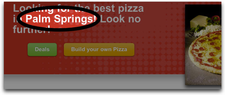
A call-to-action is a word or a phrase that encourages the viewers to do a particular action. The term is often abbreviated as CTA. The right call to action can persuade site visitors to do something you intend for them to do like buying a product, continuing to read the rest of the article, sharing content on social media, or signing up to your email list. In the digital marketing world, the CTA often consists of text with a button, although it could also be a simple link with a corresponding anchor text.
Effective CTA
An effective CTA is strongly related to the content of the page and supports people’s motivation in taking action on the content. In other words, the CTA should be clear about the benefits the people will receive when they take action. A perfect and simple example of this is seen on sites that tell people to sign up or subscribe so they don’t miss any updates.
The CTA must also provide what it has promised immediately. This is why subscription confirmation messages and thank you messages include a link to a promised content or valuable resource.
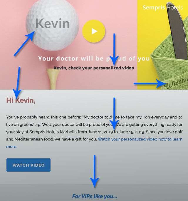
Personalization
The digital and online space is moving towards content that is personalized and targeted. From the ads that you see when you log into Facebook to the shows that are recommended to you on Netflix, the content that you enjoy the most have been customized and served to you for a reason. This behavior is clearly evident in retail sites such as Amazon or eBay were products we love are shown directly to us.
The visitors to your site also expect the same type of personalized experience, as well as in your calls to action. When comparing the three types of CTAs – basic, multivariate, and smart – it’s clear the smart CTAs outperform the two. This is because users are served content that reflects their current level of knowledge and interest on the topic.
Web pages and blog posts often cater to multiple audiences but if they all present the same CTA regardless of who the viewer is, they are neglecting a good chunk of the audience who are either too advanced for what you have to offer, or not advanced enough to need it at the moment. To accommodate these differences, Smart CTAs can be a great solution.
Personalizing CTA
Before you even build your CTA, you first have to determine who your target audience is and the manner with which you will be targeting them. In this case, you use your content management system to know the level of targeting possible and then break down each version of the CTA. An example of a smart CTA could be one that targets visitors and another one for leads.
Remember to write an action-oriented copy for your CTA. Viewers need to see something of value that can take them to the next stage of their journey. Generic copies simply won’t do as most visitors avoid clicking on prompts that are too basic. You can go for phrases such as “Get it here,” “Find out more,” or “Sign up now.”
5. Dynamic Content Personalization
One of the primary goals for online marketers today is to tailor the shopping experience and content in order to meet the needs of customers perfectly. But with customers having access to a lot of devices, and visiting sites through different networks and platforms, it can be very difficult to keep track of the habits and behaviors of buyers. This is where dynamic content personalization comes into play. It’s able to cater to the different needs of customers much more effectively and help to improve conversion rates as well as repeat business.
The Basics
In simple terms, dynamic personalization is content that is able to adapt to an individual customer and understand their buying behavior and then optimizing their journey so it is tailored to enhance their user experience.
For example, if you were an apparel retailer and a customer visits your site looking for a backpack, you could use the data from that first visit to improve their shopping experience the next time they visit the site. Your ads could be personalized to feature only backpack brands, excluding all other kinds of bags.
Companies like Netflix and Amazon are perfect examples of corporations trying to give their customers exactly what they’re looking for, at the same time improving their business model.
How It Works
Dynamic personalizations are dependent on algorithms in order to develop a clear picture of the customer, what they need, and their buying habits. It uses information such as:
- Demographic
- Geo-location
- Behavior
- Device
Once it has gathered this information, the software can then tailor each interaction the customer has to the website so they see content, products, or services that are suited to their needs.
Benefits of Dynamic Personalization
Streamlining
Instead of spending many hours manually testing and guessing what will work for your customers, through dynamic personalization you can create an automatic algorithm that is optimized for individual users.
Benefits customers
By ensuring that your site only offers content that your customer is actually interested in, you cultivate a relationship built on trust which will only improve your brand’s reputation and encourage repeat business.
Drives traffic
Think about it, if a customer visits a site where content is tailored to their needs, they would prefer sticking with the site since it already knows what they want. Dynamic personalization is one reason why so many people flock to Amazon and what made it the giant retailer we know it today.
Conclusion
These are only some web design tips to boost site traffic. The internet abounds with more helpful suggestions and tips to improve traffic. The ones mentioned above are some of the most effective ways that are easy to implement and have a track recording of boosting site traffic. You can use all of them at once, only some of them, or use them in conjunction with other tips.
About the Author:
Eliza Brooks is a passionate blogger who loves to write about digital marketing hacks, productivity, and the latest trends in technology. She is currently working with Nettonic, one of the leading web design bedford agencies based in Bedford, Bedfordshire.