

Let’s face it. Whenever you are trying to get hold of a target audience‘s attention, presentation matters. Irrespective of how informative, insight-rich and useful your content is, if your visual aesthetics aren’t pleasing, you will fail to have your audience’s attention.
Can you afford to do so in this attention economy? So what can you do to ensure that you communicate your ideas to your audience efficiently?
Be big on visual presentation. But here’s the hard part. Creating a dynamic and gripping visual experience needs a lot more work than just adding high-definition photos and images. But fret not. We’re here to help!
In this post, we will reveal to you the top 5 secrets that will not only create an appealing blog post but also, hook your audience till the end. Let’s find out exactly how.
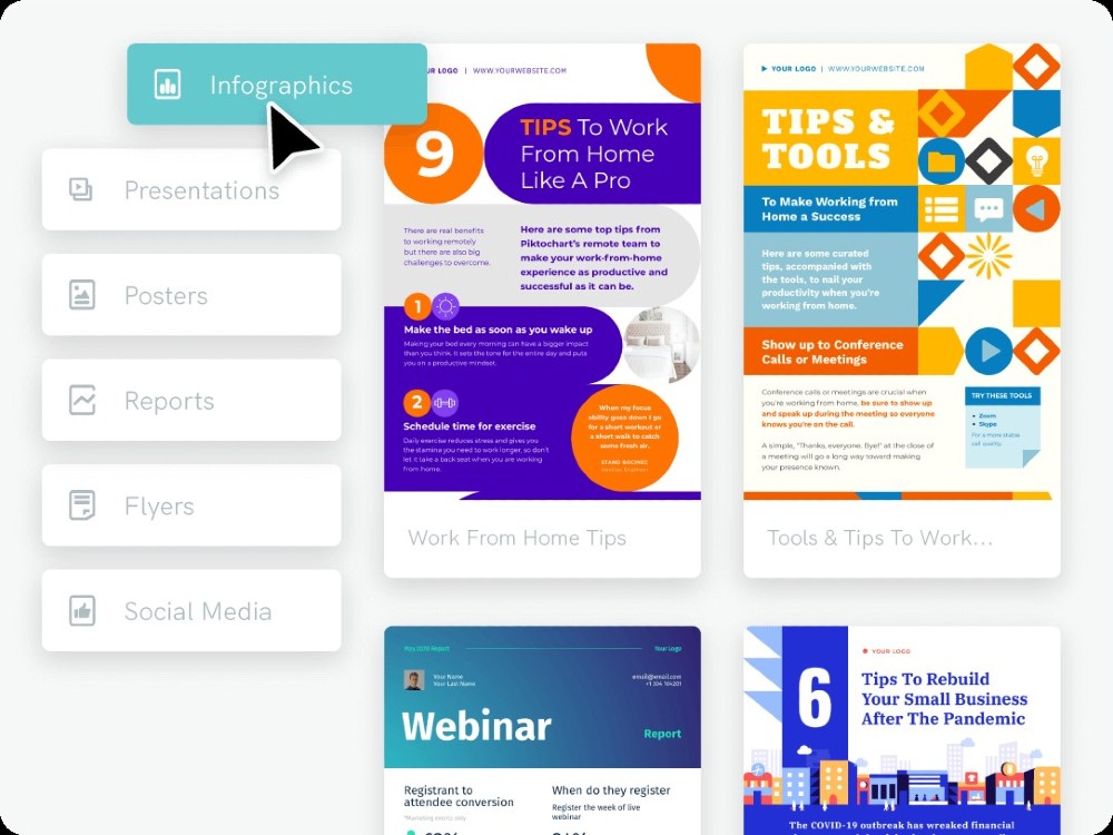
5 Ways to Improve Your Blog Visual Presentation
The key differentiator of a good design from a bad one starts from the task of outline. If you have to come with a satisfying end result, start with outlining your presentation to have a comprehensive idea of how long your content runs. Is it a 1-page blog post or 4 pages blog post? What sort of template design would you require for your blog post? This shall always be followed by writing the content. Now when you are ready to put your content into slides, let’s move to the game-changer, the presentation. Following are the top elements that can create a stunning presentation for your blog.
1. Structure and organize your content
When you are dealing with complex, vast information sets, communicating ideas in a time-constrained landscape can become a challenge. Structuring your content for maximum readability while organizing it for comprehensibility can stimulate faster learning for your audience. Here’s what you can do.
- Restrict your paragraphs to a maximum of 6 lines of text: Balancing your copy with visual content is critical for the ease of readability of your audience. Remember, less is more. Focus on just creating the main points and let your visuals do the rest of the talking.
- Create visual hierarchy: The total impact that your content creates has a lot to do with the visual hierarchy. This means your content structuring order should follow a consistent and pre-cognitive design. For instance, going from larger font to smaller is the most obvious way to do this. The key to visual hierarchy is to arrange your content logically to create cohesion in the complete content.
- Use bullets to organize your content: Having bullets in your content can instantly create a sense of organization and easy comprehensibility in your content.
- Highlight the key takeaways: Using a different font typeface and color are often a good practice to draw attention towards the points that you want your audience to never miss in your content.
2. Simplify complex concepts
Communicating complex concepts is perhaps the hardest part of any content presented. You need to come out as clear as possible for your audience without putting them under pressure. So how do you do it? Here’s what can help you achieve simplicity in complexity.
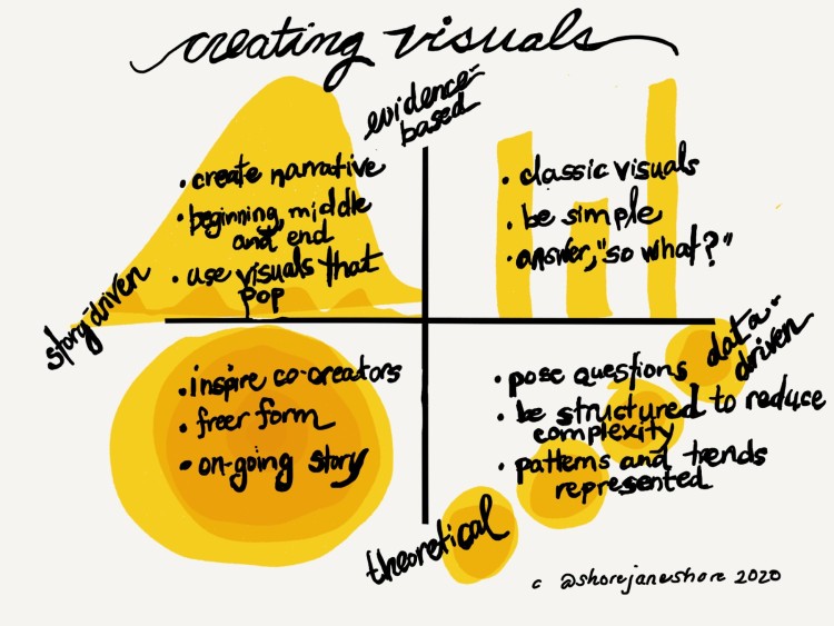
- Integrate data visualization: Numbers and statistics can become pretty intimidating to your audience fast. But the best part, it doesn’t have to be. Data visualization processes ensure that data is comprehensible, fun, and engaging. You can utilize anything starting from line graphs to pie charts to make this. Here’s a free pie chart maker for your use.
- Draw analogies to explain your idea: Examples are the perfect method to illustrate a complex concept to your audience. But there’s a catch. Using any example will not do. You need to focus on drawing real-world, practical examples that they are already acquainted with. Otherwise, you will end up jumping from one unknown, complex concept to another.
- Create a context in your content: It is one thing to illustrate your idea with data visualization tables and examples and complete another to create a context for it. Your ideas are half-baked if there is no context to them. Giving your readers a reason as to why the idea is essential in the first place prepares them to be attentive towards you. See how the benefit (the context here) of the idea can ensure you have them engaged already.
Pro Tip: For maximum comprehension, the flow should be from context to analogy to illustration.
3. Supplement your content with visuals
There’s a good reason as to why people love visuals. Humans can process images 60,000 times faster than text. Incorporating relevant and contextual images can pique your audience’s interest. Here’s how you can let your visuals do the talking.
- Incorporate a single visual style: Be it stylized photography or animated gifs, or just high definition stock photos, you need to be consistent in your choice of visuals when planning your blog post. If you want to experiment with your visual format, ensure you restrict yourself to a maximum of two formats.
- Include interesting visuals in your content: There is probably nothing duller than reading the text without any visuals. This means you need to ensure that your readers always have some form of illustrative visuals on their page, no matter how long it is. This translates to that you need to have a visual above the fold at all times. Usually, the rule of thumb here is to integrate visuals every 2-3 paragraphs consisting of a maximum of 4 lines.
- Keep your image colorful: Little bit of color can do wonders to your overall visual experience. Restricting your color choice only to your brand colors or black and white can again create mundaneness. Go experimental here. Choose colors that your competitors aren’t using. You will already start making an impact on your audience.
4. Stand out from the crowd with your uniqueness
If your blog has to stand out in the stifling competition, you must start developing a content differentiation factor. More than often, it has a lot to do with how you organize and present your blog. Here’s what you can do now.
- Use storytelling technique: Using the storytelling technique can hook your readers from the start. The best way to do this is to create suspense to get your audience’s attention. A visual can do this job perfectly. Then, you can build up the momentum with a copy to keep your audience engaged. A key element to remember here is to ensure you let your audience sit in the driver’s position. Make them the protagonist of the story. If your audience is male, then use visuals that portray a man.
- Stir emotions: Visuals are the best way to stir emotions. This means abstract and complex visuals cannot go viral. Make them direct and easy to understand. Try to keep the emotional context of the visual relevant to the copy.
- Address your audience: Ensuring that your visuals aren’t generic and fit your audience persona will create an impact like no other. Your pictures should directly speak to your readers. This will build up the emotional connection in the content, making a long-lasting impact.
5. Be consistent with your content
When you are building momentum of your content, consistency is key. No matter how good your content and presentation are, if you create sharp contrasts in the styles, you will confuse your audience. The best performing contents are highly cohesive, where each section complements the other. Here’s how you can do it.
- Use a single transition style: Monotonicity is boring for all presentation elements except one. Creating too much variety in content style for different sections of your blog will only take away from its impact. Although different parts, they all together form your blog post. This means you need to have a consistent style every time you switch to a follow-up section in your blog.
- Create single pattern breakdowns: While organizing blog post structure for maximum readability, be aware of the pattern in which you break content. Whether it is a 5 section blog post or 3 section content, having symmetrical subsections prepares your audience subconsciously for the following parts. For instance, if you have 3 key points under a sub-section, keep that consistent for each sub-sections following it.
- Keep the design consistent: Keeping your blog designs consistent can add the finishing touch to your presentation journey. Ensure to restrict your use of font typefaces and colors to a maximum of 3. Ensure your visual assets, both illustrations and data visualization charts, have a consistent size, font, and color codes.
Parting Advice
If you are to create a hungry audience who just wants more, you would have to revisit your visual design at regular intervals. Go ahead and experiment with your blog design. Find out what designs appeal to your audience the most. Remember, in design and presentations; there is no one-size-fits-all.
If you have a typical target audience, understanding their mindset can give you insight into designing your presentation that pleases them the most. From the choice of colors to typeface, everything can be customized to suit their needs. But, using the above tips can give you a good headstart to transform your blog presentation from good to great.