#1 How Design Impacts Your Subscribers’ Perception
Humans have a natural tendency to repeat certain patterns with strong affinities that ultimately impact how they engage with your content. That means that as email marketers, we should be mindful of the arrangement of content blocks that heavily affect the perception it creates. You can guide your subscriber in such a way that they consume an important piece of information upfront.

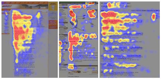
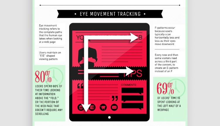
Nielsen Norman Group’s eye-tracking study found that our reading pattern pretty much consistently dominant reading pattern looks somewhat like “F,” that is, first horizontal movement, then slightly shorter horizontal movement followed by vertical movement.
#2 Which Types Of Rich Multimedia Can Be Used For Visual Email Marketing
Here’s the list of visual elements you can use:
Videos
73% of US adults are more likely to buy products or services after watching an online video describing a product or service. Videos are already a big marketing tool. Combining it with email will improve engagement significantly and likely to be clicked more often than not. When you include videos in the mail, make it a point to mention the same in the subject line.
GIFs
Like emails themselves, GIFs are showing a never-die attitude and becoming increasingly popular even among GenX. Since GIFs play automatically, it provides us an opportunity to display short messages visually. GIFs also overcome the drawbacks that videos encounter, like needing more data and requiring the user to open it on a third-party app. If the CTA button is not placed strategically on the destination page, then the purpose of sending the email will not be fulfilled when the user opens a video on other platforms. You can use GIFs to target subscribers in low latency regions.
Images
Everyone loves images. Marketers have been using images to sell services like legal consultation through storytelling (with images), which otherwise cannot be illustrated. Having the right images can slash off huge chunks of your email copy.
Infographics
With the use of infographics, you can convey multiple data sets effortlessly, which is otherwise a tedious job.
#3 How Does Multimedia Impact Your Email Size? What Is The Ideal Mail Size

When your email’s code size exceeds 102 KB, mail clients like Gmail clip off your message, and your subscriber receives a prompt asking them to click a button to see the entire message. Therefore, responsive HTML email template code size should be restricted to 100KB.
Ideally,
- You should cap the image file size to be 100KB at the maximum.
- GIFs and APNGs should be capped at 500KB.
- The video should ideally be hosted as a third-party app and embedded as a link.
If you follow the guidelines mentioned above, you can expect a very good deliverability rate and serve your readers from low latency regions.
#4 What Are The Design Factors That Need To Be Considered For Flawless Visual Hierarchy
The following elements impact your email design individually as well as in combination. By using these visual elements smartly, you will be able to convey your message effortlessly:
● Font size
Font size denotes importance. A bigger font size grabs your eyeball immediately. Bold is used to highlight a message, one of the uses of italic fonts is to draw attention to certain parts of a text, and underline is used to add emphasis.
● Color
Color palettes used in the email should be in line with your brand philosophy as well as the emotional tone of your message.
● Contrast
Color contrast is used to differentiate components of your email body. You can use color contrast to your advantage to draw readers’ attention. For example, a red CTA button will immediately draw the reader’s attention in a black and white monochromatic email design.
● Density
The number of elements packed in your email design impacts readers’ ability to focus. For instance, a newsletter will always be densely packed when compared to a promotional email focused on a single product or service.
● Placement
All important elements like the company logo, header line, and hero image of your email template must be placed in the upper fold.
● Alignment
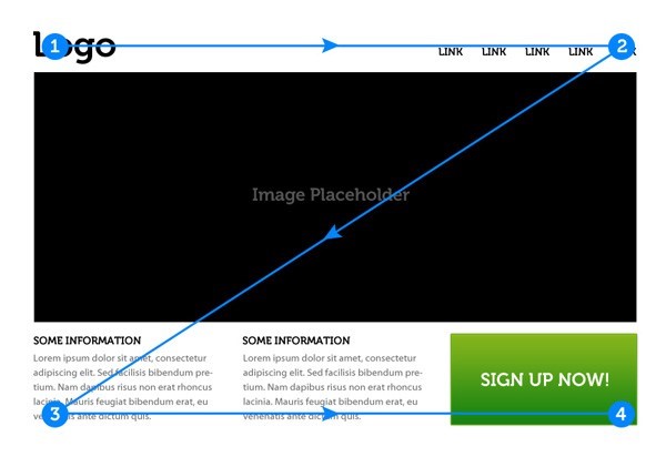
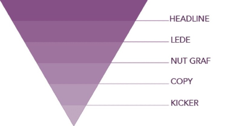
Elements should be aligned in such a way that they align with the design pattern (F-type, Z-type, or inverted triangle) you intend to use.
● White space
It helps to add perspective to your design element. It will help readers determine the importance of individual elements as well as establish relationships among them.
● Repetition
Repeating design elements adds visual consistency and helps it assimilate easily. For instance, using CTA buttons with similar colors and text will send the reader to the same place.
● Proximity
Proximity helps establish relations among elements. You should place elements with common objectives in close proximity. If they are placed far away from each other, then the reader will perceive them as unrelated elements.
#4 What Are Some Examples Of Patterns To Create Visually Appealing Emails
The following examples illustrate the use of patterns to create appealing visual hierarchies:
F-Pattern

Z-pattern

Inverted triangle

Wrap Up
There is no standardization of any aspect of email marketing and working with visuals is indeed one of the most challenging parts. I have tried to cover most questions about visual email marketing, and I hope this article clears the fog and brings clarity for you in visual email marketing.
About the Author
Kevin George is a renowned salesforce marketing cloud consultant and Head of Marketing at Email Uplers which is one of the fastest growing custom email design and coding companies, specializes in crafting professional email templates, PSD to HTML email conversion and free HTML email templates. He loves gadgets, bikes, jazz and eats and breathes email marketing. He enjoys sharing his insights and thoughts on email marketing best practices on his blog.


