

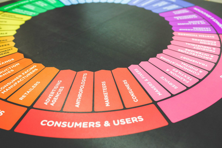
Vinyl banners have a number of different purposes and forms. They are a type of outdoor advertising that can either represent the offerings of a specific organization or company or announce an event to draw the public’s attention. In order to be useful, a banner must have an outstanding design.
There are numerous design strategies and tools that marketing specialists need to consider when designing eye-catching banners. They can include hierarchy, focal point, size, shape, graphics or images, typefaces, and matching colors.
Matching Colors
Colors are among the most powerful of all design elements. They can skillfully influence individuals perceptions of an ad. Therefore, it is very important that they are effectively used. There are a number of different ways that colors affect people: physically, psychologically, and emotionally. They can also convey subtle money or set a mood. Selecting the best color spectrum can help to create amazing banner designs. Color also facilitates recognition of your brand and attract a lot more consumers compared to monotonous black and white leaflets. Depending on the kinds of emotions that you want your banner to evoke, colors should be combined effectively by marketers to ensure the target audience has the right association. In general, using the right colors helps give a banner a unique appearance and increases its promotional effectiveness.
All colors have their own special qualities. However, in order to grab your audience’s attention, it is recommended that contrasting, bright colors and tints be used for banners. For example, after red, the most noticeable color is orange. Positive emotions are associated with it. On the other hand, blue is associated with confidence, trust, and safety. Other options include green, which is the easiest color on your eyes and is associated with harmony, health, and freshness, red which suggests love, passion, and sometimes anger, yellow, which is connected with friendliness and sunshine, black, which is symbolic of mystery, luxury, and power, and white, which is the color youth, honesty, cleanliness, and purity.
Or, black and white can be incorporated to create intrigue and a minimalist design. These color combinations all have highest levels of visibility for outdoor advertising and vinyl banners. However, it is critical to apply color patterns that are matching and complement your slogan. It isn’t a good idea to mix white and yellow since it would be hard to comprehend the information and read the text. Combining too many colors is also a mistake as well as using incompatible colors that look disharmonious and clash.
Appropriate Fonts
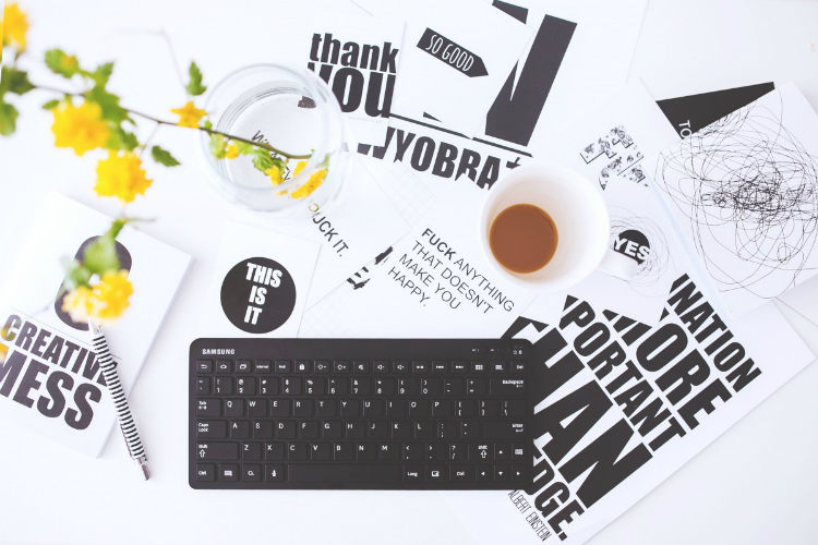
Fonts obviously affect a banner’s readability along with its impression overall. First of all, the font size needs to not be small and be appropriate so that the picture can be visible from a distance. Second, it is best to use a classic simple typeface like Bodoni, Trajan, Helvetica, or Arial, which are easy to comprehend and read. However, if you are wanting to highlight a brief piece of information (a phrase or word) then a unique font can be used. Third, you should avoid having too much detailed information included on a banner. The main point should instead be presented in a short and simple manner since the attention span of people lasts for just a couple of seconds.
Most important of all, a banner’s typeface needs to be legible so that the audience can read it, including traffic that is passing by. Therefore, the marketer should choose just one or two complementary fonts that don’t distract from the message or content of the banner. In order to create a great banner, it is best to avoid all caps and cursive, since they are hard to read. Once should preferably create a bold, eye-catching title, especially for a short title, and pair a more conservative with a distinctive font to achieve a balanced design. Using fonts out of the same design group are also appropriate, that vary in case (lower and upper), weight (bold and regular), and size.
If you have main text along with secondary information (headline and subheadline, phone number, and/or slogan) and you need to separate the different elements from one another, then you should consider a combination of the spacing, bolding and two sizes, as an alternative layout. Also, an effective banner usually is based in a contrast: a title that is super bold and a subtitle that used a subtle and cursive serif font; pairing sans serif and serif fonts; combining color, spading, and size. If the banner has a longer headline, then you might be able to apply a thin but large font. The font should also match the banner’s design and support its purpose (elegant, playful, or serious).
Focal Point
Having a clear focal point will help your banner be more attractive and effective It will also cause a passerby to focus on the ad’s most important part. Whether it’s an image or a headline, you should plan it carefully so that it quickly attracts your audience’s attention. To make an outstanding banner, the emphasis should be placed on the ad’s most important part with help from visual manipulation. For example, the position of the information on your banner can be changed, the color palettes, the direction of the text, add an interesting shape, bold font or large size. Isolating focal points using white space also is a good idea so that they are highly visible when positioned on a colorful background. It is always essential when you are designing a banner to use moderate space to separate various advertising element and to remain balanced.
A Visual Flow’s Hierarchy
Ensuring that the information is clearly organized is very important for all ads. Hierarchy is a tool that helps with ensuring that the banner is well-structured and prioritizing information. All of a banner’s elements should be situated within the specific space that is based on the hierarchy. For an enticing banner to be created, you need to consider how to space and arrange all of the elements so that the audience will understand what the ad’s main idea is. The element’s simple hierarchy is the best option to use. Also, the logomark or branding should be what is visually dominant at all time. The main object or message of the banner, which includes a special offer, service, or product should also be located in the central position.
In order to improve a banner’s design, a marketer can make use of some of these options: adding white space in between the secondary details and primary information; dividing the space of the banner into sections using graphics, frames, or boxes; repetition, such as a list with numbers or bullet points. These techniques all refine the banner’s structure, which makes it very informative. This results in the main approach for typographic hierarchy using a three-level organization. The most visible content and the most important information is contained in the first level. The second level’s elements represent the groups or sections of related information. A complete message should be formed in the third level (description or purpose) that is easy to read and understand.
Graphics
In order to draw the attention of people to a banner, high-quality banner sign graphics can be included. That helps to tell a story, evoke emotions, and express a broad range of feelings. These graphics also provide the banner with an element of entertainment or fun. So whether a photo of attractive people or cute animals, a geometric pattern, elaborate illustration, simple drawing, is used it is critical that they only are incorporated at the appropriate times. However, it is widely established that an ad that features graphics always will have a stronger effect compared to a banner that doesn’t have any images.
A well-chosen image helps people feel a connection with the product or message or the banner since it effectively conveys the main idea and its benefits. Combining the slogan and pictures will always draw people’s attention. However, it is best to avoid using small ambiguous images and for your banner to not have too many visual elements since that can produce an overwhelming look. It is also better not to combine an image with long text, but instead to replace the second one with the first element. Graphics should reveal an ad’s purpose.
Banner Size
The efficiency of an ad is impossible without having a banner that is the right size. When selecting the size of an outdoor vinyl banner, its visibility should be considered. Usually, a larger banner will have a greater chance of attracting consumers. The banner’s mounting locations should be accounted for as well by the marketing professional (so that it fits the surface properly), its distance from viewers (so that good readability is provided), usage of materials (so that waste of resources is minimized), competitive signage (so yours looks creative and unique), and the kind of audience )larger banners are required by road audiences). The banner should finally be large enough so that it grabs people’s attention and can display the message. Therefore, the size of the banner needs to be balanced with the background colors, images and size of fonts.
Conclusion
In summary, all vinyl banners need to be attention-grabbing. The success of a banner depends on numerous factors. However, its design it the most significant aspect. An attractive design that has effective color combinations, good legibility, vivid graphics or photos of products, the proper shape and size of the banner, in addition to a focal point, and having a visual presentation that is well-organized will help to design an exceptional banner that has a strong influence on customers. An important element in the overall advertising process is the location of an outdoor banner.