
In 2021, heatmaps are far from novel. They have been around for a while, and their demonstrable merits account for their popularity. An invaluable tool, heatmaps offer user activity insights that help drive web development, design choices, content creation, and more. Their benefits even extend to Search Engine Optimization (SEO) enhancements, as case studies show. However, to fully grasp their implications and optimal implementations, one needs to understand them in depth. We’ll thus devote this article to exploring this subject and discussing how to use heatmaps to improve your website.
What are heatmaps?
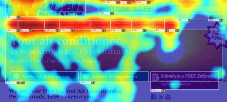
In essence, heatmaps are graphical representations of data that, visually, looks very similar to thermal imaging. As the name implies, different data values are denoted by different colors across the heat spectrum. That is, higher values are represented in “hotter” colors, and lower values in “colder” colors. This color scale typically ranges from red to blue.
This representation of data has many uses in data analysis, as it offers a visually digestible way to relay information. In the context of website heatmaps, however, this information typically concerns user activity. Thus, website heatmaps map out areas of interest, click frequency, scroll length, mouse hovering, and similar data. They then visualize the most popular web page elements in hotter colors and unpopular elements in colder colors.
Types of heatmaps
A heatmap’s type depends on the exact metrics it tracks and how it does so. The three main types of heatmaps are the following.
Scroll maps
Scroll maps track how far users scroll down a page before leaving it. Understandably, this heatmap type can inform decisions on content length, Call to Action (CTA) placement, and other on-page elements.
Click and touch maps
Conversely, click maps show an aggregate of where visitors click the most. In the case of mobile devices, such heatmaps are called touch maps instead. This type can provide insights on navigation preferences, as well as frequently clicked content elements and CTAs. This may help denote the popularity of a visual element or the expectation of a link’s presence in specific places.
Move maps
Finally, as the name implies, move maps track visitors’ mouse movements across the page. This type of heatmap can also inform page layout and other design choices.
There is no definitive proof of absolute correlation between mouse movements and visual focus, but research suggests a notable connection. Thus, move maps offer suggestions, but not conclusive proof, on which page elements draw visitors’ attention. For example, visitors may frequently let their mouse hover over areas of interest as they pause to focus on them.
Reading and analyzing heatmaps
Before delving into how to use heatmaps to improve your website, we would need to touch on reading them. At their core, heatmaps are relatively straightforward; hot areas denote interest, cold areas disinterest. Depending on heatmap types and individual software solutions, areas of virtually no interest may lack color completely. However, simply understanding their representations is the first step of many.
To effectively act on their insights, one must be able to analyze the data heatmaps provide. Consider three main questions in this regard.
- Is important content being seen?
All heatmap types provide insights into important content visibility and engagement. However, which content is important depends on your page in question. Areas of desirable interest may be, among others:
- CTAs
- Internal links and backlinks
- Contact information and forms
Typically, the upper areas of a page, or a page fold, will boast the highest engagement. In essence, the further down an element is, the fewer visitors will see it. However, this common rule does not suffice to inform improvements, as not all elements can fit into the fold area. It thus falls on design, content structure and quality, and other elements to allure visitors to scroll down.
Scroll maps will help reveal visitors’ scrolling habits, while click maps will reveal CTA click frequency. Notably, the latter can also reveal distractions.
- Are visitors being confused?
A question of equal parts functionality and engagement, confusion often underlines design shortcomings. There are two typical sources of confusion in this context:
- Non-clickable elements that look clickable
- Visual elements that distract from clickable elements
A typical example of the former is logos and other text in bold fonts in proximity to clickable elements. In this case, visitors may click on them, expecting an interaction that doesn’t take place. While this may be a minor frustration for many, it still diminishes the overall user experience (UX).
Conversely, identifying the latter hinges on reading the colder map areas. One needs to ensure that secondary page elements don’t incite engagement and thus don’t divert attention from crucial elements.
- Are there engagement discrepancies across devices?
Finally, heatmaps can reveal discrepancies between desktop and mobile versions of pages. In the digital age, and following the advent of mobile devices, businesses likely focus on both. Indeed, even Google indexes mobile versions of webpages before their desktop versions. However, the two can offer drastically different experiences and thus vary in performance.
Comparing heatmaps can highlight such crucial differences. Frequently, designing primarily for mobile devices may cause webpages to appear disjointed and sparse on desktops. Conversely, desktop-focused webpages may push critical elements below the fold or appear cluttered on mobile devices. By tracking visitors’ actions on both, you may use heatmaps to improve your website through careful corrections.
What heatmaps don’t say
As a final precautionary note, it is noteworthy that heatmaps are not absolute solutions. For one, low amounts of data are prone to circumstantial findings and may lead to poor decisions. Moreover, heatmaps only track user activity; they cannot, and will not, dictate the exact reasons for activity or lack thereof. Thus, it is up to website owners to collect sizeable data and accurately decipher their findings before making sweeping changes.
That is not to say, of course, that heatmaps aren’t an invaluable analytical tool. However, it is to say that reading them properly and acting on their insights strategically is crucial.
Using heatmaps to improve your website
With the above context in mind, we may now delve into ways to use heatmaps to improve your website. For the sake of text economy, we’ll consolidate related strategies into five main subgroups.
#1 Combining analytics and heatmaps to uncover user intent
The most fundamental function of heatmaps is, of course, data collection. By definition, they help deduce user intent by highlighting areas of interest. While this has a wealth of potential applications, combining heatmaps with analytics tools holds even greater potential.
By themselves, neither Google Analytics (GA) nor heatmaps explain why what they gauge happens. Combined, however, they might. For example, GA may highlight bounce rates that scroll heatmaps can explain. In that case, it could likely be that users bounce without scrolling because the fold-level information doesn’t appeal to them. Conversely, heatmaps may find that CTAs on landing pages are being clicked, but GA may add that conversions don’t follow. In that case, you may use a heatmap of the destination pages to better address the visitors’ conversion intent.
#2 Improved page layout to pronounce CTAs
Similarly, heatmap insights can specifically inform page layout and CTA placement therein. This practice does begin with minding the practical fold area, as scroll heatmaps define it, but it extends much further.
Typically, page layout improvements lie in refining the following:
- Content structure and white space
- Visual elements
- CTAs
In this regard, a suboptimal page layout may cause confusion through visual overload or poor content structure. Similarly, a secondary element like banners, images, and secondary CTAs may be diverting attention away from primary CTAs. Click maps and move maps can both help reveal such cases so that you may apply subtle corrections accordingly. For example, you may consider moving CTAs closer to areas of interest or move distracting elements further down, respectively.

#3 Centering the site structure on the buying process
Following this concept, you may use heatmaps to improve your website by restructuring it around the buying process. In essence, you may use heatmaps to follow visitors’ journeys and intervene to help lead them to desirable actions.
For example, consider internal link placement in landing pages. Your links at the top may be offering value, but they may simultaneously push them away from your intended destination. In effect, links make visitors leave the initial page; if they do so before reaching a CTA, you risk losing a potential conversion. That’s not to say you shouldn’t link to informative content, by all means, as that’s the cornerstone of SEO. However, you should monitor the linked pages’ heatmaps as well to ensure visitors progress toward a conversion before leaving altogether.
#4 Identification of cross-device issues
Similarly, as highlighted above, heatmaps may identify cross-device issues. A website’s desktop and mobile version may function very differently, yielding different engagement outcomes. You may discover such discrepancies if you analyze a heatmap of each side by side.
The simplest reason for such differences is, frequently, screen real estate. The two versions can’t be identical because visitors view them through screens of different shapes and sizes. In turn, what works for one may not work for the other. For instance, a mobile website may lack a header menu, which pushes visitors’ attention to elements that appear clickable. Conversely, a desktop website may have too much space between different clickable elements, forcing visitors to focus on secondary ones. You may combine scroll maps and click maps to uncover such differences, formulate A/B testing, and proceed accordingly.
#5 Improved content
Finally, it should be self-evident that heatmaps can inform content creation strategies. Layout and placement aside, your content itself is often the deciding factor that incentivizes or discourages engagement. You may thus use heatmaps to improve your website in terms of content value.
The most basic metric that denotes content quality is how far visitors scroll down. If visitors bounce soon, you may consider using more grabbers in your introductions or before the cutoff line. Alternatively, you may refine your tone and content formatting to make it more digestible. Adding images across long texts also helps retain attention, as SEO attests to. Finally, in conjunction with GA and other analytics tools, you may find that your keywords don’t satisfy visitors. In that case, you may reroute your content creation strategies around new keywords and monitor heatmaps to gauge the results.
Using heatmaps to improve your website’s SEO
On the subject of content optimization, heatmaps naturally lend themselves to SEO enhancements. Of course, the practices mentioned above overlap with SEO somewhat, but there are even more focused heatmap applications to consider. Namely, page layout and mobile-friendliness aside, you may focus on content length and quality and optimize your content’s links.

#1 Content length and structure
In terms of SEO, research indicates that length directly correlates to rankings. However, Google has insisted that length does not suffice, as “[s]ome pages have a lot of words that say nothing”. Thus, it is vital to decipher this correlation differently; quality drives rankings, and length indicates quality.
In this regard, heatmaps offer insights into user engagement. More specifically, they offer insights into your specific audience. Here, you may ask some specific questions to inform your content’s length and structure:
- How far down do visitors scroll?
- Is content scannable?
- Is visual content placed optimally to ensure engagement?
As highlighted above, deciphering user intent is a crucial factor to keep in mind in this regard. SEO best practices may dictate that 1000, 1500, or 2500 words are ideal length-wise. Similarly, it may dictate that you use 3-5 or 9 images per page. These are excellent guidelines, but how your specific audience reacts to them should also heavily affect your decisions. That is the unique benefit that heatmaps provide in this regard that full-time bloggers can benefit from.
#2 Outbound links
By the same token, outbound links are pivotal to SEO. Counterintuitive as they may seem, in that they direct visitors to external pages, they help build trust and deliver quality. Moreover, linking to authoritative, reputable sources helps search engines evaluate your content. You may thus use heatmaps to determine which of your outbound links spark interest and where to place them.
To gauge interest in outbound links, you may use a click map. This will help you gauge which institutions and other sources with which your visitors engage. In turn, you may cite these sources more frequently to deliver more value.
You may also use heatmaps to improve your website as regards outbound link placement. Specifically, you may use scroll maps to determine if some of your links drive readers away. Indeed, visitors may drop off if they encounter seemingly irrelevant links, as Stanford University found. In this case, you may move links further down or remove them entirely.
#3 Internal links
Finally, internal links are where many of the above concepts converge. Consider their significance in three key areas:
- They help search engines understand your website structure, decipher your content’s subject, and index your pages
- They allow you to establish a content hierarchy, prioritizing link placement accordingly
- They guide your visitors across your website and through your sales funnel
That’s why many SEO practitioners value internal link strategies relatively more than outbound link strategies. But their comparative value notwithstanding, internal links do present a lucrative way to use heatmaps to improve your website.
In terms of internal link use, SEO dictates that all pages should connect to other pages. This ensures you don’t leave pages orphaned and facilitates faster indexation. However, content hierarchy should also factor in, as optimal link placement can help visitors process through your sales funnel. In this regard, you may categorize pages as such, with ascending importance:
- Awareness pages; typically landing pages and information articles
- Consideration pages; typically high-value content that incentivizes conversions
- Action pages; product pages, contact forms, and other end-of-funnel pages
Guiding visitors across these stages, content relevance and quality aside, hinges on optimal link placement. That’s what click maps and scroll maps can help deduce; observe your visitors’ behavior and adjust your link placement accordingly.
Heatmap case studies
To elaborate further on heatmaps’ applications, let us briefly delve into two notable case studies.
#1 bee-seen
Bee-seen’s Bryan Plumb analyzed a blog spot that underperformed in conversions. Bryan offered a downloadable worksheet at the end of the post, which was not receiving enough clicks. Applying heatmaps, the two core issues were identified to be:
- Click confusion; non-clickable elements appeared clickable
- Click frustration; inline content received more clicks than the CTA
The solution was thus to refine clickable elements to account for users’ expectations.
#2 Associated Spring Raymond
Similarly, ASR’s faceted search interface for Catalog Data Solutions (CDS) underperformed in conversions. Visitors frequently selected the “see more results option”, eventually abandoning their carts and site.
Heatmap analysis showed that filters did not narrow down options enough. The solution was thus to refine filters and update the layout, presenting users with a more concise experience.
Conclusion
To summarize, heatmaps come in 3 distinct types; scroll maps, click maps, and move maps. All 3 provide insights into how visitors interact with websites and can synergize with analytics tools. These insights can help website owners optimize their website structure and page layout in accord with their users’ intent. Moreover, heatmaps can help identify cross-device issues, inform content creation strategies, and refine SEO for one’s unique audiences. However, reading heatmaps properly is crucial, and regular A/B tests should always inform drastic changes. Nonetheless, heatmaps offer invaluable data that can help inform decisions toward improving one’s website and boosting conversions.
About the author:

Andrew Papas is a digital marketing consultant and copywriter. He frequently contributes articles to wpfullcare.com, where he shares his insights into SEO and data analysis.