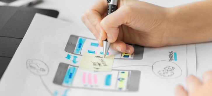
User Interface (UI) and User Experience (UX) are interrelated terms. Often used interchangeably, one is not possible without the other.
UI/UX is evolving rapidly, just like any other digital discipline. New trends keep developing as time goes by. Designers should keep track of emerging trends and apply them as soon as they can. After all, it is important to keep your client’s websites up-to-date. As we move into 2021, know the trends that will emerge and equip yourself to stay ahead of the curve.
Here are the best UI UX design practices that will take over 2021.
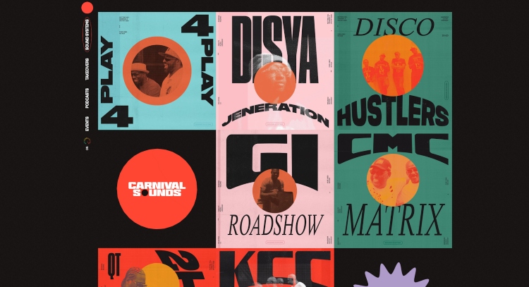
1. Dark Mode
Dark mode has been embraced in 2020, and this is set to continue into 2021. Some top brands have offered it in their products already. This includes both Android and Apple apps.
Dark mode looks stylish and modern. It is sleek and sophisticated. When you have a dark background, it is much easier to highlight other design elements. Dark mode is also friendly to the eye in a low-light environment and reduces screen fatigue.
Make sure you know the following tips when thinking about designing an app in dark mode, adding the feature to an already existing application, or simply designing the website with a dark color palette.
Dark Mode Core Design Principles:
Use Accents to add color to the design
It is crucial that you choose the correct brand colors to add life to the theme of your design and don’t overdo it—Keep it simple—The design space should use a limited number of colors that accentuate the dark theme.
Use Dark Grey instead of Black
In order for the user’s eyes to gauge the depth of the design, it is important to use dark grey colors instead of black. This can give space and elevation to the application’s environment.
Maintain Spacial Awareness
One problem with dark mode is it can reduce the space making the design feel closed in and claustrophobic. Keep this in mind while designing your theme so you can keep users feeling welcomed into the site emotionally, instead of closed off and trapped.
Meet Accessibility Standards
Dark themes can create low-level light situations with high contrast in applications allowing users with vision problems to better differentiate elements on the app. Try to keep this in mind when designing your dark theme.
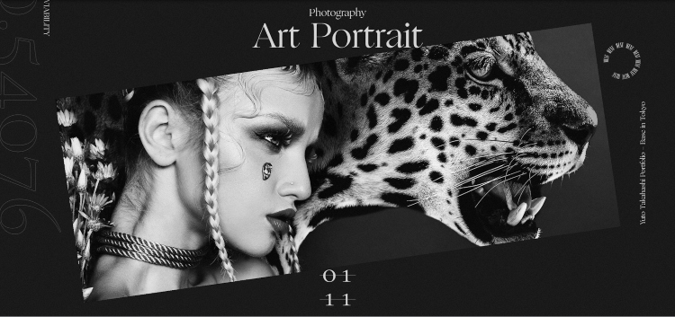
2. 3D Elements
2D effects and flat texts have been used for long enough, and people have become used to them. The introduction of 3D design has become a fascination for users, and this fascination is set to increase in 2021.
As AR and VR technology becomes more and more popular, companies will incorporate them into their design as 3D visuals.
Immersive 3D elements allow UI and UX designers to make their websites appealing to the eye. Those who visit such websites are likely to stay longer on the website, increasing their chances of closing deals.
3D elements can also provide a large advantage when you need to create photo content that is hard/impossible to get. Artists can create photorealistic 3D renders of whatever they need.
Examples of what can be done with professional-grade 3D element designs:
- Show off different products in your e-commerce store in a unique fashion
- Tell a story through 3D elements on your site through dramatic and high-quality images
- Create a new spin on classical elements that brings life to the website or application
- Add additional design elements to your funnels that set you apart from your competitors
- Display your portfolio in a new and exciting way
- Create interactive elements such as games, builders, or virtual tours allowing users to get more value from your site
- Create assets for VR functionality
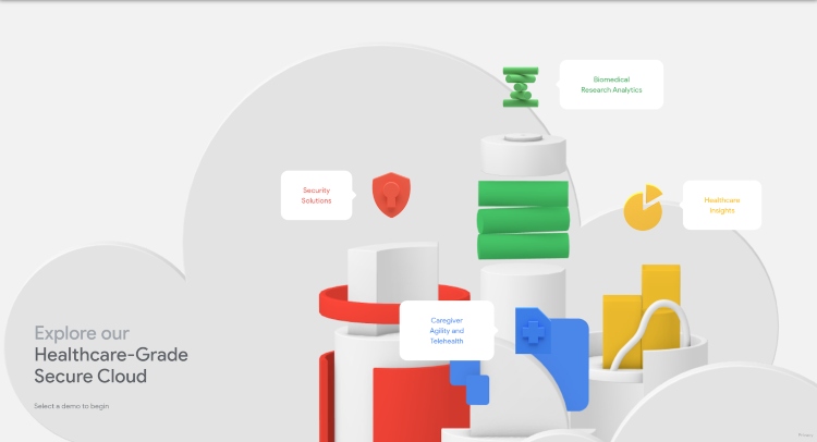
3. Motion Graphics
It goes without saying that people easily remember and understand the information presented visually compared to written information. Companies and websites are set to take advantage of this in 2021, and you should not be left out.
You can incorporate motion graphics into your UI UX design projects using tools such as Adobe After Effects. These tools can be difficult to master, but there are a myriad of tutorials and lessons out there to help you learn how to work with AE.
Motion graphics enhance the user experience by drawing the user’s attention, allowing smooth transitions, and by simplifying information.
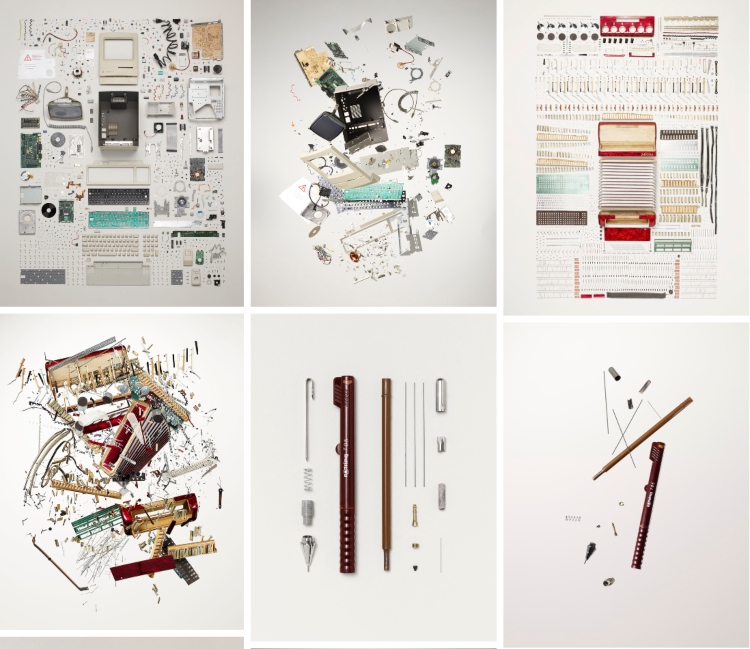
A great example of motion graphics done beautifully is Todd McLellan’s website on disassembling objects and putting them back together. We highly recommend checking out this site!
How can I incorporate motion graphics into my site:
- Create visual cues with motion graphic animations
- Create unique navigation menus that increase user engagement and interactivity
- Take users through an animated story that leads them throughout the website
- Highlight how a product is used in real-time with animations, showing a user what the product is intended to do
- Create a strong emotional impact on the user that will take them deeper into your site and your brand
4. ID Authentication
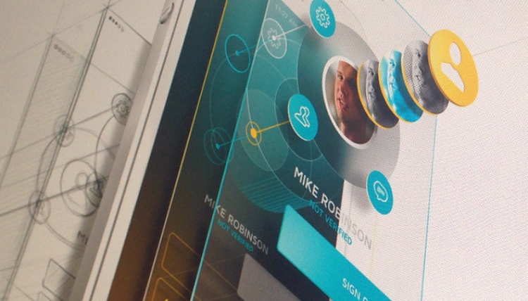
Hack attacks are a major threat, especially to mobile apps. ID authentication has, therefore, become increasingly important, and designers are taking note.
The use of fingerprint sensors and facial unlock features in UI UX design trends is set to take over 2021. More people are storing their data online, and the security of such data is a major concern to users.
2020 has seen app developers and designers focus on facial identity, which will continue into 2021. Additionally, biometric locks will be widely applied.
ID authentication promotes trust among users.
5. Multiple Device Synchronization
Virtually all of your users are using more than one device. They use different devices at different times, and you need to have a UX design that allows synchronization across various platforms.
Your users will have a better user experience if they can have the same experience consistently across all of their devices.
Apart from smartphones, laptops, desktops, and tablets, 2021 will see UI UX designs offer synchronization capabilities for wearable tech such as smartwatches.
Benefits of utilizing Multiple Device Syncing:
- Allow users to receive updates and messages through wearable devices
- Take a users experience and seamlessly integrate the same functionality across multiple devices
- Allow users to buy products with ease across desktop, mobile, and wearable devices
- Give a better user experience across all devices
6. Speed
With the addition of all these different types of design elements, it is important to remember the speed of the website should remain as fast as possible. This presents a challenge to designers and developers alike.
Weigh your different options, implement UI elements that can spice up your website, but be continually optimizing the website as you go to keep load speeds down as much as possible.
The longer your user has to wait, the higher chance you will lose them altogether.
Luckily, internet speeds are only getting higher, allowing for more leeway between design elements and load speeds.
Through the introduction of 5G technology and gigabyte download speeds, the internet is getting faster and faster as time goes on.
It is keen to remember that less fortunate countries are less inclined to have access to this type of tech. If your demographic resides in one of these countries, take extra precautions when optimizing your site/app’s load speeds.
Want to learn more about page speed and how it can affect your website? Check out this article on why page speed is important for SEO.
7. Blending Images and Graphics
In 2020, there has been a design trend where the graphics on sites are overlapped with different images. This UI/UX design trend allows you to exercise your creativity and add a unique character to your website.
Blending these aspects allows you to add the right feel to your website depending on the type of business it is involved in. You can have a formal and serious tone for your real estate website, and a playful touch if the website is an entertainment company.
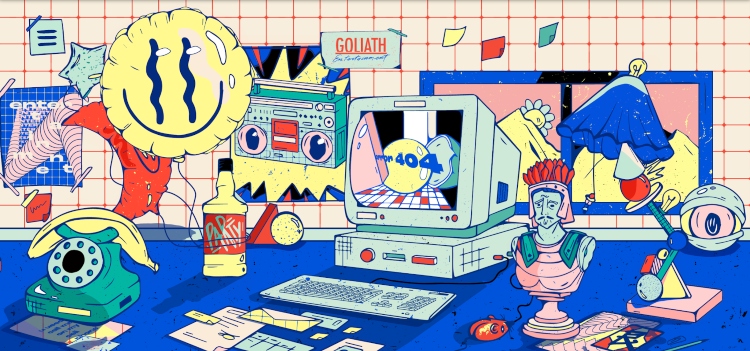
Goliath Entertainment is a french party planning company that has an absolutely incredible website loaded with these design elements, as well as incorporating some motion graphics and 3D objects.
Through the use of shadows, layering, and contrast; Goliath has taken things to the next level with this intuitive and innovative design.
Each individual object in this picture below is linked to a certain portion of the website that continues to tell the story of their company, what they do, and how they do it. It’s a fantastic representation of blending different elements together to create a unique story.
One problem with this design style is it can be a bit overwhelming. One thing to bear in mind is to make sure that your user isn’t experiencing sensory overload when they get to your website.
Final Thoughts
UI/UX design is an ever-evolving practice where we see many new trends each and every year. It can be hard to keep up with all the brilliant web designers out there. But utilizing the most innovative design practices in your own work will help lead you to create your own methods and trends as time goes on. Always stay ahead of the curve by recognizing trends in their early stages, and develop your own as you increase your expertise in your craft.

