New Start: Get The Perfect Logo For Your Brand This 2017
The Logo is the first impression of your brand. Either, it is the startup or a well-established and well-known business, the logo says it all. When it comes to identifying your brand, your logo is probably the first thing your customers will think of.
It is most often the first impression, getting the perfect logo for your business which will long live in the minds of the audience or consumers. Getting a perfect logo for your business is as important as getting your services and products a perfect fit for your consumers.
Brand Management: What is a Logo?
According to Wikipedia,
“A logo is a graphic mark, emblem, or symbol commonly used by commercial enterprises, organizations and even individuals to aid and promote instant public recognition. Logos are either purely graphic (symbols/icons) or are composed of the name of the organization (a logotype or wordmark).”
In 2017, get yourself a brand redesign with the perfect professional logo design, and kick starts this New Year with a bang!
One must keep in mind that a good branding is very important to attract new customers and in a bid to attract new consumers and audience. It’s important to carry yourself a better visual reputation.
After reaching a company's website via a referral site, 36% of visitors will click on the company's logo to reach the homepage.Click To Tweet(Source)
Remember that an attractive logo and better branding is a way to strengthen the brand and in a way promotes the brand and help in presenting a professional image of the business in front of consumers. It symbolizes the quality, which you believe in.
Do you know several global brands deliver a message through their logo design?
You should learn from them. Inspirations can come from anywhere.
Let’s see some examples here:
See the logo of FedEx:
FedEx advertise their speed and delivery accuracy more than you might think, and actually promote these factors in their logotype by hiding an arrow between “E” and “X”.
Gillette – Men’s safety razors
The hidden message in the Gillette logo is difficult to find. If you look closely you’ll notice how razor sharp “G” and “I” have been cut. This represents the sharpness and precision of Gillette razors.
LG – Electronics, chemicals, telecommunication, IT
Have you ever noticed the LG logo? The face is seen in this logo is made up of the letters of the brand – with “L” illustrating a nose, and “G” forming the remainder of the face.
VAIO – Laptop computers and peripherals
The “VA” of sony VAIO logo has been made to look like an analogous signal, and IO resembles the number 1 and 0 – which represents a digital signal.
As you know, logo is the first visual component of a brand identity.
There are many tips, which play a part in the better logo for your brand, there are several companies involved in the better logo designing for you.
There are some awesome online logo maker resources like Designhill. This is a perfect fit as a logo design maker if you are looking for an affordable solution for the best professional logo design for your business.
Some Tips to Help You Find Your Perfect Logo
Simplicity of logo
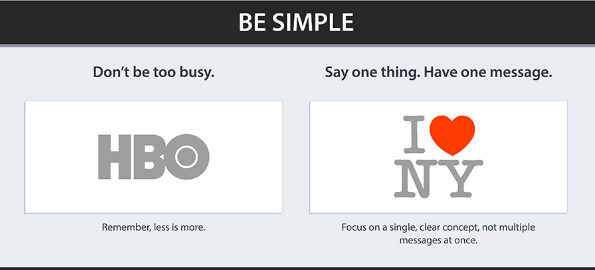
Simplicity matters in logo design. You should keep your logo clean and simple, never ignore the true purpose of a logo – recognizable and memorable. Don’t use unnecessary decoration.
Simple logos are timeless, simple to redesign, and versatile.
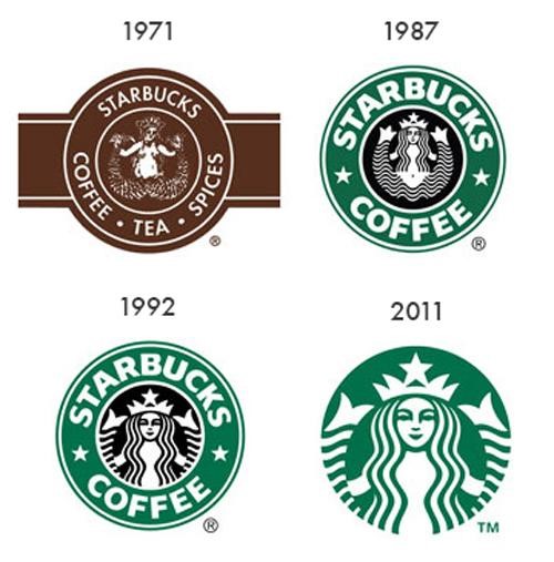
See the image below shows the evolution of the Starbucks logo:
(Image Credit: Y-Designs)
What do you see?
The Starbucks logo has remained relatively consistent – simple circular shape, sans-serif font, and mermaid character.
Logo and graphic design companies understand that the logo must be simple. The simplicity tells it all.
The logo may look good on your business cards, but is it equally good looking at all other places like websites and social media channels?
- Don’t make it boring and complex, but make it simple and memorable.
- Make sure that complex design can be recreated.
- It should be easily recognizable on a small business card and on a large banner or billboard.
- A Logo should work as well in Black as it does in full color.
Keeping logo simple is one of the best approaches towards achieving excellence.
Logo Color
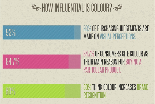
Our mind is inherently programmed to respond to color.
The perfect color combination in a logo is equally important as making it simple and appealing. Taking time in deciding the perfect color combination is the best approach towards picking the right combination of colors for your final logo color.
(Image Credit: Hubspot)
Keep in mind; too many colors can make it expensive to print and also make it difficult in representing.
Take a look at Creative Bloq words about the psychology of color to understand what each color says to your customers.
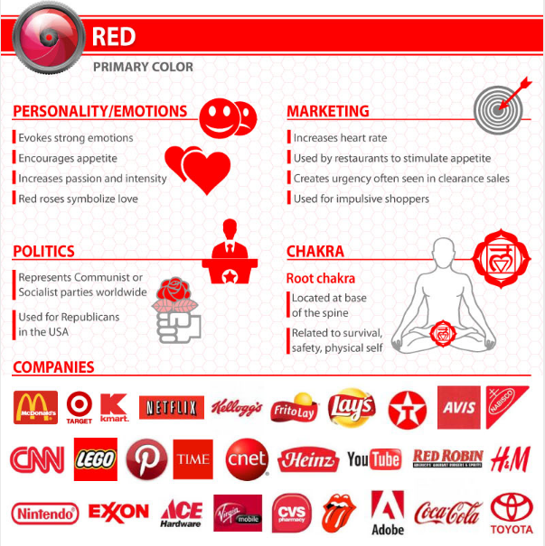
Red implies passion, energy, danger or aggression; warmth and heat. It has also been found to stimulate appetite, which explains why it is used in so many restaurants and food product logos. Choosing red for your logo can make it feel more dynamic.
(Image Credit: WebPageFX)
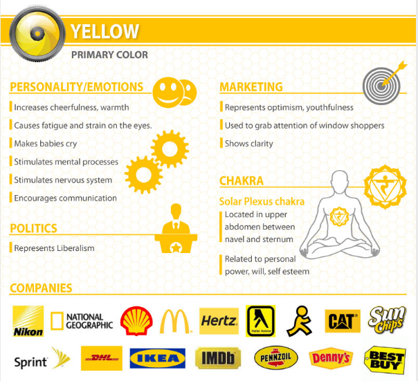
Yellow requires cautious use as it has some negative connotations including its signifying of cowardice and its use in warning signs. However, it is sunny, warm and friendly and is another color that is believed to stimulate appetite.
(Image Credit: WebPageFX)
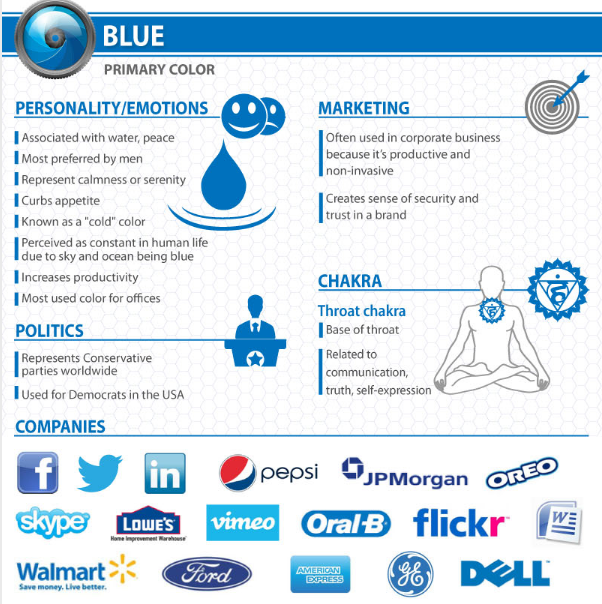
Blue is one of the most widely used colors in corporate logos. It implies professionalism, serious-mindedness, integrity, sincerity, and calm. Blue is also associated with authority and success, and for this reason is popular with both financial institutions and government bodies.
(Image Credit: WebPageFX)
Orange is often seen as the color of innovation and modern thinking. It also carries connotations of youth, fun, affordability, and approachability.
(Image Credit: WebPageFX)
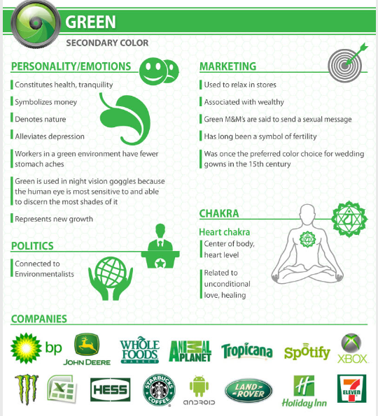
Green is commonly used when a company wishes to emphasize it’s natural and ethical credentials, especially with such products as organic and vegetarian foods. Other meanings ascribed to it include growth and freshness, and it’s popular with financial products too.
(Image Credit: WebPageFX)
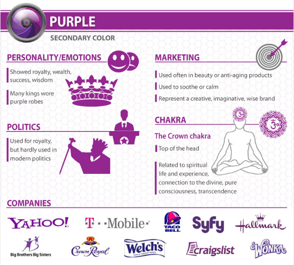
Purple speaks to us of royalty and luxury. It has long been associated with the church, implying wisdom and dignity, and throughout history, it has been the color of wealth and riches.
(Image Credit: WebPageFX)
Black means Sophisticated. Luxurious. Formality. Style. Elegance. Expensive. Authoritative. Black is used by “high-end” brands as main or paired with another color. Black is somber, serious. Most logos are actually designed in black & white first.
(Image Credit: The Logo Factory)
Fonts in Logo
Finding a perfect font for making your logo unique and simple is an important step in making a logo a perfect.
Logo maker sites understand how to professional logo design with the right usage of fonts in a logo. Choose a font which immediately says everything about your brand and complements your logo design.
According to UCreative,
“Choosing the right font is the difference between saying something with sincerity or sarcasm, between sounding knowledgeable and unsure. So how can you make sure you choose a font that lets your business speak with the voice it deserves?”Click To Tweet
- Keep fonts clean and simple.
- Analyze what fonts your competitors are using.
- NEVER use too many fonts.
- Find out which font suits your brand best and reflect your brand identity.
- Don’t use trendy fonts.
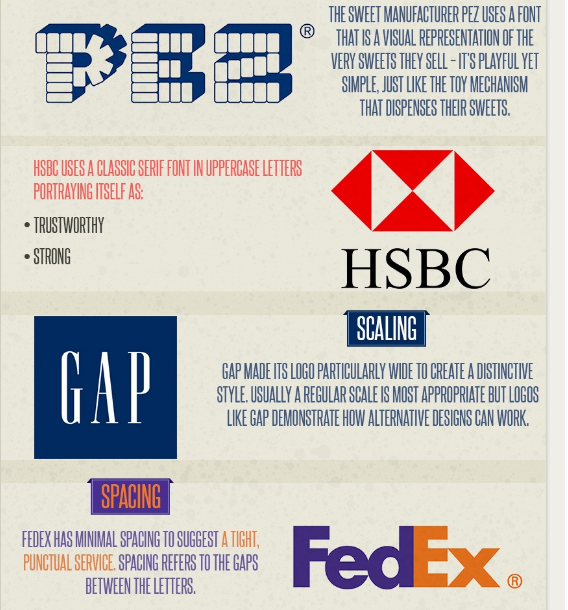
Let’s take a look to see how global brands do it:
(Image Credit: Hubspot)
Symbolizing your brand
Choosing a logo, which complements your services or business niche is the most important step in designing a perfect logo.
You just can’t opt any logo design, which symbolizes a wrong business of yours. The logo can be an image, which consumers can care about and can image the business niche of yours, by just having a glimpse of it.
Logo Type
Choose whether your logo will be a symbolic one or a text one (word mark) or a combination of both. Always look for the perfect fit logo for your business as a logo is the first impression of your brand.
Symbolic – Memorable and Instantaneously recognizable.
Word Mark – Uniquely styled text logos which spell out the company or brand name.
Combination Mark – graphics with both text and a symbol/icon.
Do your research, take inspirations, understand your audience and start creating your logo.
Have you created a great logo for your brand or company?
Would you like to suggest something?
We’d love to hear from you. Please let us know in the comment section below!
Megha Parikh is a digital marketing expert and has been journeying through the world of digital marketing for more than 7 years. She especially enjoys learning about social media marketing and conversion rate optimization while exploring her social and interpersonal skills.


