
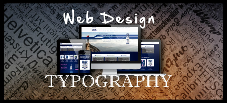
With the huge push in technology over the past decade, it is not unusual for people to have personal websites, business websites or websites dedicated to teams or special events. There are templates that you can use or companies you can hire to set up your site, and of course, you can always create it yourself. Regardless of what route you go, the font you use is important.
To make the maximum impact possible, your font should look great, be easy to read and make an impression. The typography you choose can keep visitors on your page and encourage them to read what you have written. If you want to select the right font for your website, the following tips will help.
Typographic Hierarchy Is Important
Figure out what your hierarchy is going to be and then implement it. Both titles and subheadings can help readers understand what you are trying to say and can keep them active on your page. In addition, you can utilize certain tools, like bolding your font and changing up the color, to place emphasis on certain words or thoughts. For some ideas check out Font Bundles.
Keep It Large
The size of your font is very important. When it is small, it makes it difficult for people to read what you are trying to say. This is particularly true if they are attempting to view your site on a screen with low resolution. When it doubt, keep the font on the larger size. This also makes it easier for people who are accessing your information on their smartphones or other devices.
Stay Away From Justified Text
Justified text often messes up the spacing on your page, leading to white space. Different viewers see your information in different ways, depending on what they are using to access your page. For example, the site may look different if the user is on a PC versus a Mac. If the text is justified, the spacing could be way off for some people. Therefore, utilize centered typing or flush left.
Smart Punctuation Is Key
Avoid primes and double hyphens. Instead, en and em dashes and typographer’s quotes should be utilized. If it works for print, it works for your web site as well.
Be Careful With Special Effects
There is a time and a place for special effects. You do not want to saturate your website with them because a lot of shadows and gradients can be difficult to look at. Think about what you want from your page and use these special effects deliberately. When you do, you can highlight certain text and ensure that your overall layout looks great. In addition, things like buttons, starbursts and special icons should not take over your page either.
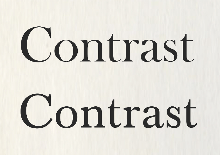
Make Sure There Is A Lot Of Contrast
There should be plenty of contrast between your background and the color of your font. Therefore, if you use a light font, go for a dark background. If your background has a lot going on, leave it blank. Anything that you put in the space will be difficult to read.
Make Sure There Is A Lot Of White Space
White space is great to have around your type. It is a design element and can make the information easier to read.