One of the most effective marketing tools is the rather humble poster. A poster can help even a small business or a startup promote their latest services and products at an affordable cost. A creative design can easily grab the potential customer’s attention and it can promote the brand image, raising awareness on the business. This versatile marketing tool comes with a lot of added value for the business, so knowing the key elements of an effective poster is highly important.
Readability
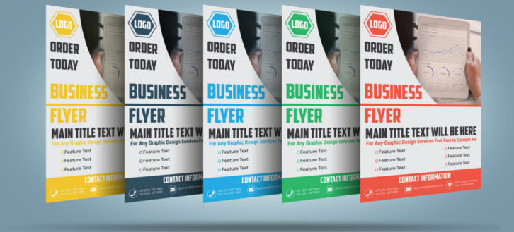
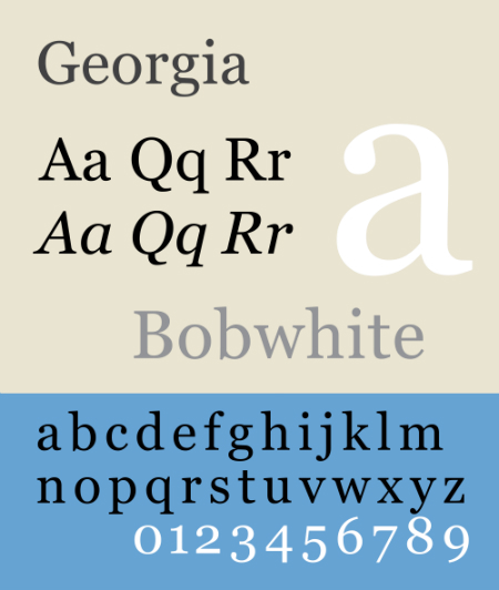
Most posters come in standardized sizes, but you can ask your graphic design agency to create a custom poster. What you need to bear in mind is its readability: the text on the poster should be easy to read from a distance. The actual design and the message you want to send to the viewer are important when you will decide the size of the poster and the content. Most posters have three main sections, which are the headline or the main phrase, the details and the contact information. A great way to make them easy to read is to find a mix of typefaces, which work good together, drawing the reader’s attention.
Contrast
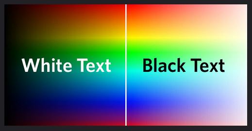
After choosing the fonts and their size, your designer is going to ask what are the colors you want to use. Your company logo is going to appear on the poster, so you will probably work around its colors to create a contrast. Another option is to leave the text do the talking and choose highly contrasting colors, like white and black. The contrast can also come from using an image against a background, for example a black and white photo on a white background.
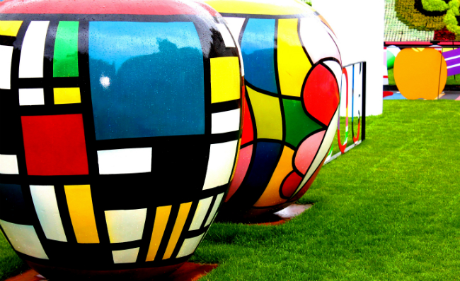
Another way graphic designers create contrast is using shapes, patterns and space. Round shapes used along with sharp ones, spaces and portions of text, repetitive patterns can make a poster stand out.
Scalability
A poster is going to be part of a larger marketing campaign, so it should be scalable. The graphic design agency can advise you on the best options when it comes to this element. Another thing you need to consider is the fact your poster should be online and offline friendly.
Location
The size of the poster, its design and additional features have to complement the place where it will be exposed. Depending on the location of your poster, the designer can establish the most effective typeface, font size and the location of the elements on the poster, even the colors and shades to be used. For example, if your poster is going to sit next to a green wall, it needs to stand out, so the designer will avoid using green on the poster. Another important thing to consider is the height, which is very important. The main message of the poster needs to be at the viewer’s eye level, so you need to establish if your audience is going to sit down or sit up.
By communicating with your graphic design agency you can work together and come up with a creative poster, which can become a valuable tool for your business.
If you want to present the poster you just created in an effective way, you could try using a poster mockup.


