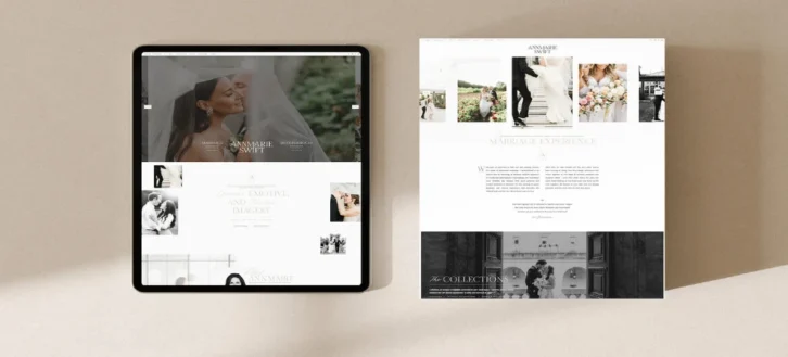
Whether you’re talking about your primary business website or your dedicated app, few will argue with the fact that the web design itself is important. However, what you might not consider to the same degree is how your branding plays into this. You might know that you want to ensure that your brand is consistently identifiable throughout the user experience, but it’s something that can run deeper than that.
These web pages are an extension of your branding, and understanding all the ways in which this can be inferred from the perspective of your audience can have you prioritizing robust web design that reflects back on you as positively as possible.
Functionality and Professionality
If your app doesn’t work at all as it’s supposed to, it won’t matter if the aesthetic is perfectly aligned with your wider brand, the association that will be formed between this and your brand is that your products also don’t work. In order for your brand to really shine through your app design, you need to use it as an opportunity to showcase your professionalism and your commitment to producing products and services that shine, refusing to settle for second best.
This means examining every aspect of your app and tightening it up, so the user experience provided is one of seamless efficiency. It’s not about creating something that visually wows them every time—a successful app that people enjoy using is one that does exactly what it’s supposed to, without regular or noticeable issues.
What should you focus on among these issues of functionality? Navigation is incredibly important—ensuring that everything is properly labeled, easy to find, and responsive enough to be visually readable by the user, though this is something that does also come under the aesthetic design in some ways.
The actual functioning of the intended service should be high up in your list of priorities, and this means examining what that is. If APIs are a core part of what your app looks to provide, examining technologies like an implemented open source API gateway can make the process of using it utterly seamless, with as few performance issues or delays as possible.
On top of that, it’s important that you’re ensuring the safety and security of all your audience data, as any sort of breach or leak that results in its loss is going to reflect negatively on your brand— especially if it looks as though you didn’t implement the necessary security.
A service that takes all these issues seriously, looking to implement quality wherever possible, is something that audiences recognize. A brand that wants to be seen as such is one that cares about what it provides and won’t be seen as being in it for a quick and easy buck.
The Design Itself

While the aesthetic is something that’s arguably secondary to the actual functioning itself, that’s not to say that the aesthetic is entirely unimportant. However, when you’re trying to figure out what to prioritize, it might be that you only have so much of a budget available to work with. If you can deliver an app or web page that functions as it should, providing an optimal user experience, then you’ll be in a good position to work on the aesthetic and improve it from there. However, even from the get-go, you’re likely going to want to take a few key design considerations into account.
First of all, you’ll want to make sure that the branding is noticeable throughout the app. Whether this just means that the color schemes used are consistent with those used elsewhere in your branding, or that your logo is relevant and present on every page, these can help to keep your brand identity in mind—especially if you’re proud of the quality of the service being provided.
Secondly, you might want to adopt a minimalist, sleek design. This is for a couple of reasons: firstly, it makes navigation easier and can prevent you from unnecessarily cluttering the page with information or visuals that don’t need to be there. Furthermore, it actually doubles as a convenient design philosophy when you don’t have the necessary budget to implement more expensive visuals.
Once you do have the capability to do that, however, it’s important that you’re selective with how you do it. The temptation might be to go overboard with the visual side of things, but you’ll still want to keep it relevant to your brand iconography, and you’ll want to avoid overwhelming your audiences with effects and animations. Feeling overwhelmed or confused might simply make them leave the app. The animations should serve the function and purpose of the app, perhaps then relating to how responsive it is—such as appearing in response to clicking certain links.
Consistent User Experience
Your presence throughout the online world is something that you can very much utilize here to your own benefit. On your app or website, linking in your social media pages can draw your customers’ attention toward them, potentially increasing your follower count and drawing their eyes to your marketing.
This also works the other way around; those who are only familiar with your social media pages can be guided toward your website or app, increasing your traffic and engaging with your services more directly. This matters for your branding because it creates an online presence that feels unified. Wherever your audience members go to interact with you, they are greeted with a way to find your other pages. Information that appears in one place should be consistent with what is said in another, and this can make you look professional.
Ideally, your social media channels and other pages like it should look to guide your users toward your app or website. These are your digital hubs, where you’re able to tell them everything that they need to know, in an environment that is completely your own—that’s why you want to use them as opportunities to put your best foot forward and show them what you’re all about.


