If we lived in a perfect world, the process of generating business from your new and long-time prospects would run like clockwork.
First, they visit your site. Next, they will find products that they can add to their cart. Finally, they follow through with their purchase with no hesitation at all.
Seems perfect, right?
But, here’s the reality: Not everyone who visits your site is going to make a purchase. In fact, a majority of your site visitors are going to leave without purchasing anything.
In a data by SmartInsights, the average conversion rates of e-commerce stores on different industries through Q2 2018 is just a meager 2.86%.
In that sense, one word will likely stand out to you. Average.
But the thing is, your goal is not to become average, right?

By focusing on making necessary improvements on your e-commerce site, and enhancing your customer’s on-site experience with your brand, it is possible to boost your conversion rates two to three times over.
So if you want your conversion rates to be higher than the average e-commerce store, we will look at some effective ways to make this happen.
1. Optimize your product images
When it comes to purchasing products online, people want to know what exactly are they getting. It is one of the most crucial elements to get someone to convert and boost your e-commerce conversion rate.
Images are essential in improving your conversion rates online. So, if you have to choose a single thing that will sell your products online, then those are images.

So how can you improve your images and, eventually, your conversion rates?
Well, you need to optimize your product images, place lots of white space around them, and pick the high-quality ones.
Also, you need to pick multiple images. The more those images are, the better. Of course, not all users will look at each and every one of them, but if they want to look through multiple images, then it is there.
Highlight the product in as many angles as possible or in various forms. If the product is usable, users should have the ability to zoom in.
So, how are images going to cost you?
If you are going to hire a top product photographer, then give them a large commission, and enjoy those top-notch photographs.
Alternatively, if you want to go the DIY route, then here are a couple of improvements that you can try without having to spend anything:
- Foster interactivity around your images. Ideally, customers should be able to pinch, zoom, rotate, and scale your images. You want to be as close as they could get with the product.
- Use a high-resolution image.
- On the photo of the product, add whitespace around it.
- Utilize as many options and photo angles as much as you can.
2. Have a clear call-to-action
The user experience a customer has in your store has to be smooth. It should be flawless in a way that users will not have to look for anything. It should be obvious to them, right from the start, how things would work.
So, if users are finding it hard to locate the “Check Out” or “Add to cart” buttons on your site, then you are failing miserably. Why? Because these are the most important buttons that you should have in your store.

They should be prominent, big, and bold. As much as you can, avoid using text links.
Your call-to-action will tell visitors what to do on a specific page. For instance, if a prospect lands on your landing page, a CTA will encourage them to place a product on their cart.
Another example: A CTA placed at the end of a blog post might prompt people to buy a product or download more information.
Look at your site with a goal of giving a clear path to purchase, and see to it that every page or every piece of content has a clear and actionable CTA that you can focus on.
If there are CTAs that are far too complex for the average reader, simplify them. Also, ensure that these CTAs stand out by offsetting it from the rest of your website’s color scheme.
3. Make your website visually appealing

If your site is not in a manner that keeps web visitors glued on your page ‒ and moving forward into purchasing something ‒ then none of the strategies that we are going to discuss is going to make a difference.
With that being said, your site should be visually appealing, as well as visually persuasive.
4. Increase your website speed
There are a lot of case studies correlating better ROI with fast-loading sites.
In an experiment conducted by Radware, even a 2-second delay on their site has cost them a 50 percent drop in their conversion rate. Another study shows that by reducing a site’s load time from 8 seconds to 5 seconds, the page experienced an increase of about 18 percent.

Also, note that e-commerce sites with seemingly large photos take about 4-8 seconds to load. But by making necessary improvements, this can be significantly reduced to about 1-2 seconds only.
What you can do is to copy your product and homepage URLs, then test them with Google’s PageSpeed Insights tool to know where the fastest improvements are coming from.
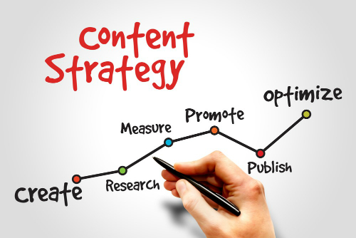
5. Deliver a strong content marketing strategy

Developing a strong content strategy can do wonders for your business in a lot of ways. In fact, according to the Content Marketing Institute, content marketing:
- Makes as much as three times the amount of leads as paid search campaigns.
- Creates trust to approximately 61% of consumers.
- Leads to about 600 percent increase in conversion rates.
Also, note that the content that you are presenting to your audience needs to:
- Help them solve a problem that is related to your specific niche.
- Show the value of your brand’s offerings
- Stand out from most of the content that is present on the web.
At the end of the day, your goal is for your audience to get the most of what you have to offer.
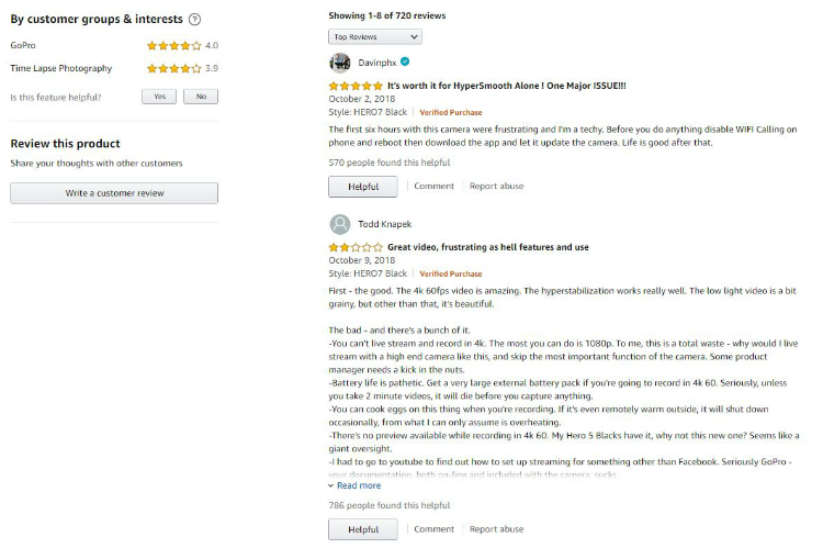
6. Show customer product review
Do you remember when was the last time you bought a product online? Did you go to product reviews first before buying? Well, we bet you did.

To give positive reinforcement for customers to give reviews, offer them an incentive every time they buy something from you as a way to thank them for providing a review.
Also, ask the customer to voice out any complaints. That way you will have the opportunity to address these issues personally, and helping you earn more positive reviews.
7. Improve your product descriptions
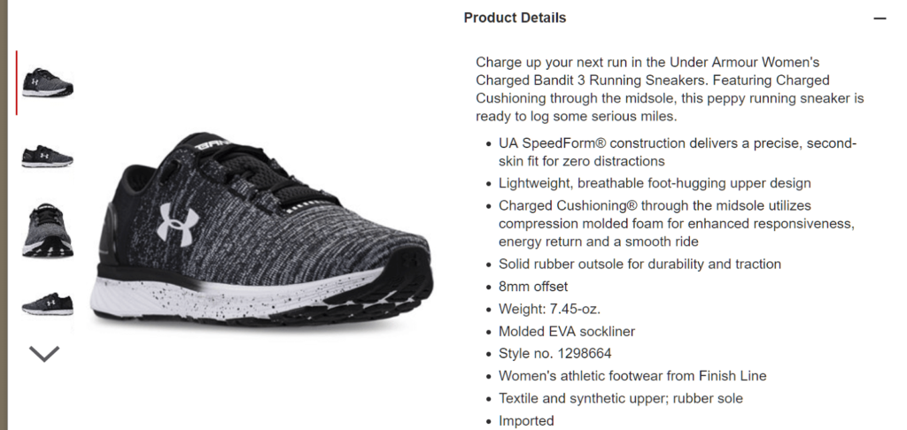
Your product descriptions matter. Your product description’s function is to provide information, so that you can help a customer decide.
Have a concise and informative summary, while capturing the essence of what a product is, what will it do for them, and why they should buy it.

Focus on the benefits while communicating value at the same time. Also, the longer version of your copy will give you the rest of the information, and answering questions a prospect might have.
Note that whenever you are selling something, do not just copy whatever is written on the manufacturer’s descriptions. It badly hurts your SEO and will label you as a copycat. Your product will not stand out as well.
That’s why there’s always a need to write better product descriptions. Add that personal touch so that you are speaking with your audience directly. Manufacturer descriptions hardly make that far or hardly stands out.
8. Use e-commerce conversion rate optimization tools
There are a lot of tools that you can utilize when it comes to e-commerce, and these tools will help you track and measure your current conversion rates.

Here are a couple of examples:
- Google Analytics:The most essential tool that you need to use, giving you a holistic perspective of your current web analytics.
- Google PageSpeed Insights: This tool lets you know the reason your site is loading slow, as well as the errors that you have on your website.
- HotJar: A great tool for knowing how your audience interacts with your site by utilizing a heat-mapping tool.
- Quantcast Measure: Tracks the user’s usage on your site, giving you an advanced demographic data on a pay-per-click basis.
- Clicky: An excellent e-commerce tool that provides you with real-time analytics of your site or blog.
- Decibel Insight: This tool lets you quantify and improve your customer experience.
- Optimizely: A top A/B testing tool
- Google Forms: If you want to make survey forms without breaking the bank, Google Forms are easy to create and share with your existing customers.
- Five Second Test:This tool is a straightforward way to get first impressions from your audience.
Over to You
Conversion Rate Optimization is a fantastic strategy to help increase your e-commerce business’s revenue. It is crucial to have a solid understanding of the average conversion rate in your specific niche, and then craft a plan that will help improve your own performance as well.


