Fifteen years ago, doing business via the internet was still unexplored territory. Now as a company you can no longer be successful without a website. However, for some people, a website can be a stumbling block because they don’t have the skills to build one themselves. Here we will find out 10 must-have steps that can give you insight into why things are not going so smoothly.
The costs of a developer are quickly too high for many companies and startups. But even if they invest, their website turns out to be unsuccessful. This is mainly because many companies do not know what they want or need.
The key to a successful website is in the preparatory work. Here are 10 steps that you have to go through when you build a website or create a website yourself. Do you currently have a website, but it is not successful?
With the following steps, you not only get new insights, but you can also save yourself a lot of time, money, and frustration.
Step 1: strategy

The first step is also the step that most companies struggle with. However, a qualitative strategy is essential as it serves as the basis for the whole project. The big problem is that people often don’t know what they want to achieve with such a new site.
They are aware that they want a new website, but the purpose of the website usually remains vague. Think about what you want to show your site visitors about the company and the added value it can bring to your customers. It is necessary to do this exercise before you start with the technical side of your website, as the results of this strategy will also have an impact on the final structure and design of your site.
To create a successful website, you need to free up time to think about who you are, what you do, and what is the value of your business to your customers. If you as a company cannot formulate an answer to these questions, how do you expect your potential customers to see your added value?
It is also necessary to determine what the end goal of your website is, as this also has an impact on the elaboration.
Some examples:

Conversion: The visitor makes an online appointment, leaves his or her details to download an ebook, or buys a product.
Inform: find contact details and possible opening hours quickly, what can people do with your product or service.
Convince: why they should choose your products.
Is the website unclear? Visitors will also experience this lack of clarity. The first impression of your company is crucial. Set up a strategy to convey a clear and professional message.
Step 2: Customer journey

After determining the core values of your company and determining the message you want to send to your website visitors, it is time for the next step: the customer journey.
The customer journey for a website is the journey that starts from the moment that a customer has a problem for which your company has a solution, until the moment that your customer proceeds (whether or not with you).
Often your site is the first step visitors take within your digital ecosystem. It is, as it were, your business card where a good first impression is very important.
By determining a customer journey you also get an idea who will be the ideal visitor to your website. The information on your website should be based on the question: who will use your product or service and how will that person search for relevant information?
An example: statistics show that young people spend a lot of time watching YouTube videos. You can then communicate better with this target group by offering more videos than written content on your website. Make sure you know what can convince your primary visitors to stay on your website longer. The type of content you offer plays an important role here.
You also have to imagine how potential customers move through your website and what impression you make with each new action. Does your company’s message remain clear on every page? Which pages should be added so that your potential customers continue to navigate smoothly through your website? They should get to pages where they can convert without much effort.
What content can make them communicate, convert, and stay on the website? These are all questions you should ask yourself before continuing to build your website effectively.
Step 3: Sitemaps

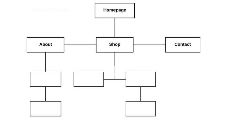
When planning your website you will already have an idea which pages you want to implement. Therefore, draw all these pages within a structure to obtain a clearer overview.
To further detail your website structure, we recommend designing a mind map on how to build the website page by page.
However you map your website, you will always have to figure out what the main categories in your main menu will be. The navigation bar is the basis of your website structure.
Then you carefully map out which site pages should be included in which category (also to create content silos). When mapping your site, don’t forget to think about the user experience during each phase: can the customer easily find his way to what he needs?
Step 4: Wireframes

The next step you will take is to build the site with the help of wireframes. A wireframe is a construction drawing of your future pages that summarizes the different parts that will be present.
With a wireframe, the emphasis is on capturing the navigation, the layout, the content, and all without spending much time in the graphic design. This way you can fully focus on the structural.
Some more tips for creating wireframes:
Design is for later: Don’t worry about the aesthetic of your wireframe to avoid moving the discussion from content to formatting.
Save time and costs: No matter how small your website is, it is always useful to create wireframes first. For example, designers and web developers do not have to make continuous adjustments at a later stage. That costs a lot more money.
Consider the coherence: If you use a certain type of button for an action, use that button consistently for all actions. This quickly creates clarity for the visitor to the site.
Step 5: Content

The content you provide for building your website will not only bring you more visitors but also ensure that they stay longer and get a better picture of your company. This is very important for converting, but also to make your website score better in a search engine such as Google.
As we discussed earlier, you need to understand who your potential customer is and what type of content they prefer. In most cases, a combination of written content, images, and video is a good choice. Also, make sure that the content you provide clarifies what your company stands for and matches the message you’re trying to convey to the user.
Content marketing is extremely popular nowadays for these reasons (higher search engine rankings and conversion). It is crucial that the content is an added value for your potential customer and that is where things usually go wrong.
Step 6: Design

The design of your website is the next important part that we will discuss. Sometimes people put too much emphasis on creating a beautiful design and not other important steps like wireframes. Designing a website in a user-friendly way is quite simple. People are instinctively attracted to visually appealing things.
On the one hand, choose a design that makes people want to visit your website and stay there for as long as possible. On the other hand, your design must remain consistent with the message and values of your company. That should be the goal of a beautifully designed website. You have already worked out these steps in step 1 and step 2.
When we talk about a user-friendly website, we talk about User Experience Design or UX Design. Many factors within UX Design can influence the potential customer, but we have already identified four essential ones:
Trusted elements: A website must contain elements that the visitor is familiar with from other websites. For example, when you click on the company logo at the top, the visitor expects to return to the homepage.
Simplicity: Make sure that the visitor is not lost in the structure, but can easily achieve the intended goal. This is due to the simplicity of User Experience Design. For example, register, contact us, complete purchase, …
Availability: Provide visitors with relevant information when they need it. For example: during an online purchase process, the visitor expects to be able to calculate the shipping costs at the beginning and not at the end of the payment.
Recognition: UX Design makes it clear to the visitor where he can click and which interactions are possible. For example, use recognizable and familiar visual features such as underlines, different text colors, or buttons.
Don’t forget that the user-friendliness of your website will have a direct effect on how people view your company. Does your website have an unclear structure? People will quickly get a bad picture of your company and leave your website faster.
Step 7: Systems
Do you want to integrate your website with mail, CRM, marketing automation – or other systems? Take enough time to choose and implement the right systems. Think carefully about which marketing system, e-commerce platform, or e-mail system you will implement.
Mia has extensive knowledge of different systems that grow your website. It should help your business generate and maintain leads and identify the needs of potential customers.
Step 8: Bug Testing

It’s not a good idea to send people to your site before it has been thoroughly tested. Take the time to test your website and its functionalities. The last thing you want is to see poor visitor behavior statistics because visitors have trouble navigating or converting.
Therefore, allow enough time to see if everything works and your message is consistent. If you don’t, all the previous work has been in vain.
Here are some more tips so you don’t miss anything:
Test in different browsers: Your site may appear differently in different browsers. This also applies to certain functionalities. Be sure to test your site in Internet Explorer, Firefox, Chrome, and Safari.
Test on different screens and devices: Make sure your website looks just as nice on a laptop as it does on a tablet or a smartphone.
Check hyperlinks: If you use a lot of hyperlinks on your website, it is recommended to check whether they all work.
Do user tests: Not only test your website yourself but also let your target group of friends, family, or colleagues test your new website.
Monitor performance and speed: It is important that your site loads and performs quickly. This also affects the rankings in the search results.
Step 9: Analytics

If you reach this step, your website will be active and hopefully, you will get a lot of traffic. If your message is consistent and the content is tailored to your target audience, you’re on your way to owning a successful website that meets the needs of your potential customer.
But the story does not stop here, you have only just started. If you’ve set everything up properly until this step, you don’t need to do much more than making some minor tweaks to your site now and then.
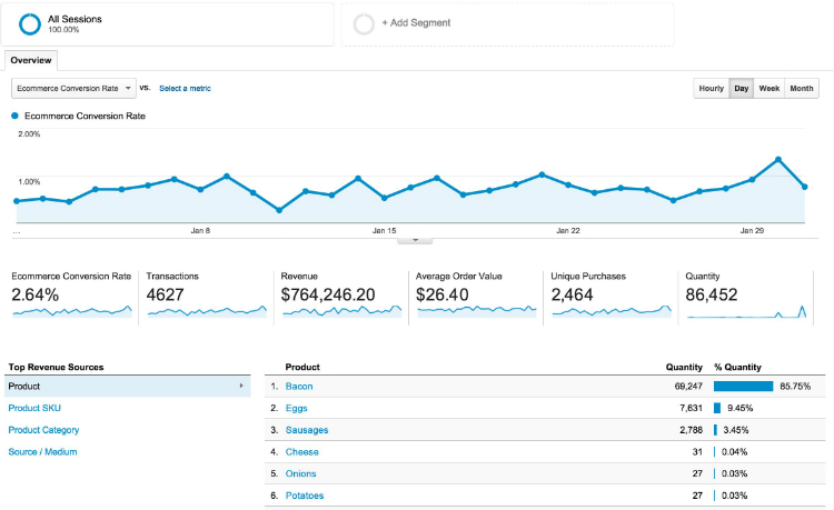
Measuring the surfing behavior of your website visitors is an essential way to grow your business. Google Analytics allows you to see things like which buttons visitors click on the most, where the most traffic comes from, and how long people spend on your site.
With this data, you can better understand what changes you can make to your website to attract more targeted traffic and make the user experience even more pleasant.
Do you want to get more out of Google Analytics and grow your business with it? Then read our tips and also get access to all the precious data that Google Analytics has in store for you. Read it here.
Step 10: A / B testing

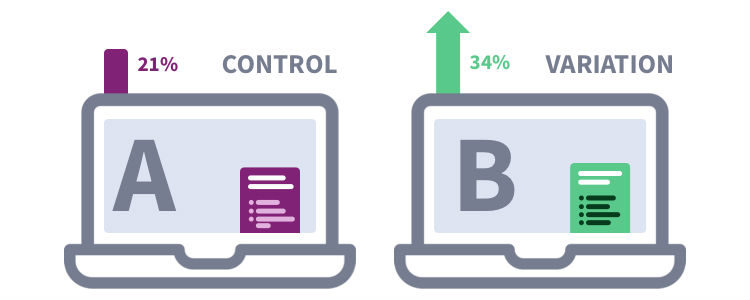
Another way to collect valuable data about your website is to do an A / B testing. With an A / B testing, you test two different versions of something to see what is most successful.
Are you not yet familiar with this phenomenon? Then be sure to read our blog post with 10 tips that you should pay attention to when you start with this. Read it here.
Most companies think of 3 things when doing A / B testing:
- Which title performs best on a page?
- Which text on my Call-To-Action (CTA) converts more?
- Which color of my CTA button converts more?
But there is much more to consider to have the perfect landing page. Nowadays much revolves around the right persuasion techniques. We already give a tip of the veil which belief techniques make your website more profitable.
Scarcity: Many websites such as booking.com eagerly use this technique. You will have seen: ’23 people are viewing this offer ‘or’ only 1 room available ‘. It encourages your customers to make a decision faster because your offer doesn’t seem endless.
Reciprocity: People appreciate the generosity. Have you given your visitors anything in the past without them having to give anything back? Chances are they will be happy to do something for you next time.
About the Author
Helen is the author of the website Xploited Media. She tried out lots of website designs. She has a grateful mind to help others, so she had made various design that gives best result. She encourages her readers to design their ideas and information on website using her tips and tricks.


