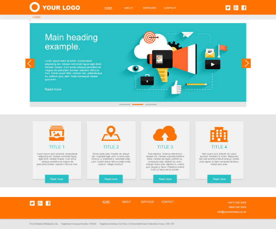
Your website’s design can make or break your business. Going digital is more than just launching a website. You have to take every step carefully. There are guidelines that every web designer should follow when creating a business website and branding yourself or your new company.

One of the main rules in website design is that your site should be user-friendly and pleasing to look at. The following are some of the ways that you can get such a site:
How to Build an Engaging Website
1. By making it Easy to Navigate through the Site
People hate things that they cannot understand. Furthermore, online users can be very impatient. This is why you need to make sure that your website’s interface is user-friendly and easy to navigate through. The customer should be able to find what they are looking for with ease.
When your website is not too complicated, your buyers become comfortable with what you have to offer them.
2. By using a Simple Layout
Many businesses strive to have a website that’s second to none. Sometimes, this idea derails them, and they end up with a complex-looking layout that only attracts a few clients. You need to bear in mind that a business website doesn’t need to have too much going on.

The most important things in a layout are the essentials, for example the content needs to be arranged and spaced well so that the readers can easily read the information, while the design needs to remain simple with a hint of uniqueness to it.
3. By Consistently Posting Interesting Content
People love to read what they are interested in. This should tell you that your content is the backbone of your website and you should post consistently! Say for example if you are a fashion site, you can share articles and other information about helpful tips on starting a clothing line.

People also want something to entertain them. Therefore, regardless of what you want to communicate, you need to make sure that the content remains intriguing as well as interesting.
When trying to spice up your content, always remember to use captivating visuals since they will attract more attention.
4. By Creating a Clear Call-to-Action
It would be absolutely wasteful to watch your customers just visit your website and leave as soon as they’re done reading your blogs without doing anything. On that note, you should have a clear call to action that lets them share your site’s URL or subscribe to your website. This is one of the best ways to drive traffic to your website.

A clever way of setting up your call-to-action buttons is make them pop up as soon as one visits the website. You should also make the wording short on that pop up button.
5. By Utilizing the Whitespace
The whitespace consists of the blank space that’s left out with no text or images. In actual sense, it doesn’t have to be white. You can use this space to capture the reader’s attention.
A smart move is to include your logo in this white space. You can also choose to include separate features that you want visitors to see as they quickly glance through your website – it could be a list of awards that your fashion brand has won over the years.
6. By Using Colors
You can use the colors that define your brand to design your website. A good rule of thumb is to use at least two colors. You can select contrast hues for the icon buttons.
The use of different matching colors captivates the users and visitors.
7. By Making your Website Interactive
You have to be aware of the fact that customers will use different platforms to access your website. This is why you have to make it interactive so that it can fit different screen sizes.

Another advantage of having an interactive website is that it increases your search engine rankings.
8. By Engaging Users with Videos and Images
Another way to make your site more effective is to use videos and images to engage your users. In fact, this strategy is more likely to work because people are used to sharing pictures and videos.
Use scalable pictures and videos that your users can share with one another.
Conclusion
Your website gives customers the first impression of your business. Therefore, you have to make sure that the design is top notch so that you don’t risk losing any potential customers. Visitors are usually turned off by complicated websites with poor layouts.


