Most popular and largest companies have been known to spend a lot of money designing their business logos- for one good reason. A bad logo can sink your brand.
Having a killer company logo that demonstrates who you are and what you stand for is important. Consistency goes a long way. Your logo should be the same across all of your online and offline platforms.
Here is the secret. Nike, Google, Coca Cola, Apple, and many other famous companies are recognizable by their brand logos because their founders had a deep understanding of brand principles.

For instance, Nike’s logo was designed to denote motion on a shoe, and Google’s logo was designed to denote fun and that’s why its logo has multiple fun colors.
Well, most of these famous company logos you see today have gone through an evolution, maintaining consistency and the message they are intended to communicate.
The flexibility, agility, and straightforwardness of a brand can greatly impact on how long the company can last in business. Equally, the company’s name and logo can have an enormous impact on its success. Putting them together in a way that shows what a company is all about and leaves an enduring impression on the company’s customers is something every business owner aspires to achieve.
In this article, we share the best tips on how to create a killer company logo while improving your brand.
But before that…
Benefits of Having a Professional Company Logo
Do you have a professional logo for your brand? Did you know that a logo is one of the key elements when it comes to promoting your brand?
A study suggests that humans process images faster than text; therefore, having a logo can make the public know what you are and what you do even before they can read your brand copy.
For the doubting Thomas, here are a few benefits of having a good company logo.
Publicize Your Brand
When people come across your business website, the first thing they come into contact with is the logo. And as the mantra “a picture is worth a thousand words” when it comes to having a company logo, it can’t be anything further from the truth.
People are more likely to remember a company that has a strong and memorable logo than one that does not have one. Besides, your business will stand out from the crowd no matter how many of them they are in the industry.
Brand Promotion
Without a strong promotion strategy, your business is as good as dead and a logo is one of the best elements of a powerful marketing strategy.
The good thing about a logo is that it delivers plenty of information in our image and this can be beneficial, especially when you have a limited space to promote your products.

Brand Recognition
What comes to your mind when you are looking for sportswear and you see a logo with a tick sign? You will know that the shoe is a product of the Nike Company automatically. That’s how Nike made themselves easily recognizable by the public and that’s what having a professional logo can do to your brand. Besides, customers are more likely to trust a brand with a professional logo than one without.
The good thing is that you invest in a few dollars to create a great logo and brand loyalty follows.
Professionalism
Did you know that customers find brands with logos being professional than those without?
Just search around and you will be surprised to see that all successful and big companies have a logo even if it’s just the company name with some font style and color.
In fact, even if you started the company today and you have a professional logo, customers will think that you are an established company and those without a logo, no matter how long they have been in business, the public will always think they aren’t established.
Follow these tips below to create a killer company logo today:
1. Understand the Types of Logos
Sometimes company owners think that having a cool and nice logo can improve their brand. However, that’s not the case.
The first thing you want to do before you start creating your company logo is to familiarize yourself with the types of logos.
This way, you will be able to have a clear picture of the logo that best suits your company. There are different types of logos suitable for different businesses. Although they are a mixture of lettering and images, they can give your brand a unique feeling.
“Your logo is what your customers interact with when they come to your business, says, Leviticus Alex, the author of the article titled “Tips for students who want to have essayshark reviews on college-paper.org reviews”
You don’t want to miss an opportunity.
Here are seven types of logos.
- Monogram logos: Monogram, also known as lettermarks are logosthat entail the company name. They are usually initials of the company name. Companies with monogram logo designs include IBM, BBC, NASA, CNN, and HP. These types of logos are easy to design and redesign. If you co-own the company, these are the types of logos you may decide to create.
- Wordmarks: These types of logos use the company name as logos. They make recognition of your company easier. For instance, Microsoft, Dell, Samsung, Coca Cola, Lego, and other companies use their names as their company logos.
- Pictorial marks: Pictorial or logo symbolsare used by global companies. These logos use pictures that convey messages of emotion. Examples of brands using pictorial logos include Twitter, Apple, Shell, WWF’s panda, etc. Although these types of logos are great, they may not be suitable for a new company or a company that isn’t recognized.
- Abstract logo marks: These types of logos are generic in form. They don’t restrict you to a picture of something identifiable. You just create something that uniquely identifies your brand. Pepsi and Adidas are a good example of companies with these types of logos. The good thing about these types of logos is that the symbol can easily tell the public what your company does.
- Mascots: These logos use an illustrated character. Because of this, they can entice the younger generation and families more easily. Examples include KFC, Kool-Aid Man, McDonalds, and Mickey Mouse.
- The combination mark: These types of logos involve a combination of pictorial marks, lettermarks, and wordmark. Examples include Amazon, Burger King, Dunkin’ Donuts, Taco Bell, and Lacoste.
- The emblem: Emblem logos are those mostly used by schools, government agencies or organization. They are like badges or seals in that it’s a font inserted in a symbol or icon. Think of BMW, Starbucks, Harley-Davidson, Veritas, and others. With these types of logos, you don’t want to include too many tiny details.
2. Check Your Competitors
You need to get some inspiration before you can create a killer logo for your brand. The best way to get inspired is to check websites and social media profiles of your competitors. Does your rivalry’s logo look attractive; do they leave a lasting impression on the public? How do the logos help the company attract customers? Do you see anything that needs to be changed? Why?
This way, you will be able to improve the way you had been thinking about creating your logo.
3. Be Creative and Unique
A logo should be able to make your brand stand out from the crowd. You want to leave a lasting impression on the public; a killer logo can do it. Although you can get some inspiration from your rivalry’s logos, you should keep your logo as unique as possible.
After all, as topresume professionals say, when you imitate your business rivalry, you will end up being the same. In fact, no one will recognize your brand. In short, your logo should be 100% unique. No copying.
4. Know Your Brand
Well, although it’s an image, a logo has more meanings than you might be thinking. It’s what makes people know about your brand and what it does. It plays a bigger role in introducing your brand to the public. It must attract your potential customers for you to last and prosper in business.
Ask yourself.
Do I intend to arouse emotions? What do I aspire to achieve?
You definitely need to know all these for you to stay at par with the latest trends. In addition, you must be able to tell the meaning of your logo yourself.
Ask Microsoft, Apple, Coca Cola, and other famous companies and they will tell you the meanings of their logos.
Once you know your brand, you will be able to know how to express it in your logo.
5. Check What’s Trending
Well, you need to focus on several safe choices including the use of bold and elegant black or white logos and so on, but you also need to ensure your logo is a killer one. For that reason, you need to create something rebellious. Check out the latest design trends. For instance, you may try bright colors, metallic logos, illustration substitute instead of letters, color gradients, just to mention a few.
6. K.I.S.S (Keep it Simple)

Don’t over complicate things. Go the simple way. Just ensure your logo can introduce and describe your company to the public. When you make a logo that’s too complicated, it turns out to be bad not only for your company but to your customers as well. Too many tiny details clutter the message.
Don’t use too many ideas or fonts; restrict yourself from using too many colors. In fact, the less the colors you have in your logo, the better it is when it comes to printing business cards and other brand publications.
7. Spice up Things With Colors
But don’t overdo it to the extent of making your logo look like a rainbow. Thinking about the personality of your brand is good but the image it portrays is also something you should consider.
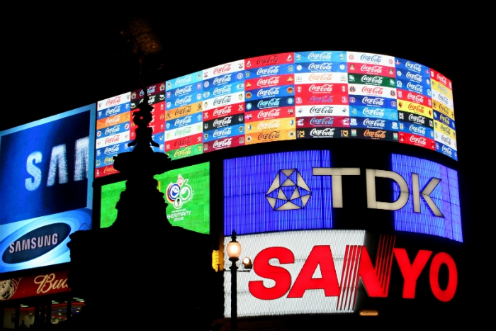
You want to grab the attention of your target audience. Colors can do it. But you must understand that different colors have different meanings. They say “white” means simplicity and or cleanliness and “green” is for growing. Therefore, don’t use the green color when you want to mean peace. Using the wrong color on your logo can send the wrong message to your target audience.
8. Create a Logo that Represents Your Brand
When a person comes across your logo he or she should be able to know what your beliefs and pillars are. It should be attractive and professional. Customers will buy your products only if they can trust your brand. Your logo needs to show them you are genuine.
Customers will judge you by your logo. If your logo doesn’t speak what your business does, no one will trust you. A killer logo combines iconography, typography, and color. If you miss these three, your logo is dead.
9. Make it Compatible
You need to use your logo on print and online, you also need it to display properly on mobile phones, apps, on different social media platforms, video ads, and any other places you will want to use it. You can start by creating something simpler and then improve it from there.
10. You Can Always Improve it
Don’t expect your logo to work the first time. All the beautiful and killer logos you see today started from something different from what you see. Even if you design a great-looking logo, don’t despair when you see that no one is recognizing it. Over time, it will become popular.
Again, if you find that the logo doesn’t meet the purpose you created it for, you can always improve it.
Final Words
Your logo represents your brand. What it is, and what it does. It is the first thing the public sees whenever they interact with your brand on different platforms. Use these tips to create a killer company logo that will improve your brand.

