LinkedIn has become the social media platform for professionals all around the world. However, with LinkedIn’s popularity comes greater competition. Companies and professionals alike must find ways to stand out in a crowd. That is why all parts of a LinkedIn profile should be maximized, especially the first things people see.
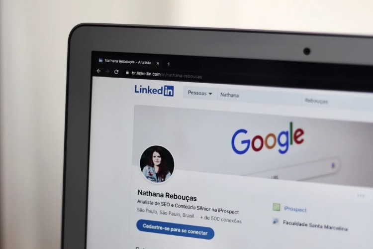
Many people often ignore the LinkedIn banner. While it may seem like a mundane part of a LinkedIn account, it could increase views up to 11 times. If you want to truly stand out, having a professional LinkedIn background is an opportunity to create a visual impact. But making your own header might be intimidating if you have little digital design experience.
If you use LinkedIn frequently, then chances are you know how important branding is. That is why your LinkedIn header must emulate who you are and what your corporate brand is. After all, you want to make a good impression. What better way to do that than through a unique and recognizable banner?

You don’t need to be a graphic designer to have an engaging LinkedIn cover image. In fact, creating one is made more accessible through Venngage and free LinkedIn backgrounds! And, to strengthen your design and make it memorable, check out these effective tips on how you can make your LinkedIn banner stand out.
1. Stick with your branding.
In the professional world, branding is an identity. It helps companies and professionals become easily recognizable at first glance. Take McDonald’s, Apple, and Google, for example.
Keep in mind that the platform is a professional networking site, and most of your potential viewers are highly likely to be professionals. Sticking with your branding is the most practical thing to do. It doesn’t make sense to put something unrelated to your business. This is not just limited to LinkedIn.
The bottom line? Express your professional or corporate identity.
2. Highlight important details.
Do you have an exciting event coming up? Are you going to release a new product? Maybe you want to share your service? Whatever it is, you can treat the LinkedIn background banner as an opportunity for subtle promotion.
It is the optimal place to showcase a product, your work, or an upcoming event. Make sure to highlight important details front and center when you decide to use your LinkedIn cover image in this manner. Take note that you can also input your contact details so people know how they can reach out to you quickly.
3. Tell people about your mission.
Another way of utilizing LinkedIn headers is using them to let people know what exactly your mission is. It can either be your company mission statement, tagline, or a unique value proposition. Doing this is a good way of attracting potential clients, business partners, or employees.
Additionally, a good mission statement can arouse interest. Since the banner is the first thing people see, you want to make sure to spark their curiosity enough to browse your account further.
4. Keep it simple.
It might be tempting to include a lot of information in your LinkedIn cover image, but it’s best not to overcrowd it with too many details. It can easily be an eyesore and look very cluttered and amateurish.
Sometimes, it’s best to keep it simple. You don’t always need all those graphics, but it is easy to get carried away with templates, colors, and fancy fonts. So remember to keep it simple and not overdo it. People will likely ignore an overwhelming visual, and that is the last thing you want to happen.
5. Think about your target audience.
The most helpful tip is to think about your target audience; they are the ones who you want to attract, after all. So when you are creating a professional LinkedIn background, keep in mind your customer or client persona.
Once you have identified what that persona is, try to figure out what appeals to them best and align your design with it. Knowing this can help you customize your banner to be most effective in delivering messages to that audience. The goal here is to design a banner that will resonate the best with them.
6. Showcase photos.
Sometimes the easiest route to take is to simply use photos for your LinkedIn header. But that doesn’t mean you don’t have to be strategic about the image you will use. Don’t forget that the LinkedIn banner is a professional representation of you, your company, or your services.
So what pictures can you use? It depends on what you want to highlight. You can choose a photo of your workplace, a snapshot of you working, the city landscape of your location, the people you serve, and more! It all boils down to what profession or industry you are in currently. Some people even use an abstract image!

Whatever you choose, make sure your LinkedIn banner is aligned with who you are in the professional world. Having a unique cover image will help you make a good impression initially, and Venngage can help you design your own to be noticed more!


